Learn how to change an ordinary photo into an Andy Warhol inspired piece of art with this Photoshop tutorial. - Melissa Clifton
Andy-Warhol-Up Your Photographs
Pop Art Recommended for Beginner to Intermediate Level Photoshop Users
Step 1: Abstracting the Photo
 If you are a fan of pop art and the work of Andy Warhol, then this is the Photoshop tutorial for you.
The first step is to find an image/photo. Warhol created his silkscreen prints from a variety of sources and subjects. There really is no limitation on subject matter at all when you consider that Warhol's work ranged from Coca-Cola bottles to Marilyn Monroe.
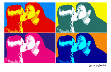
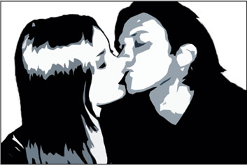
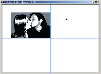
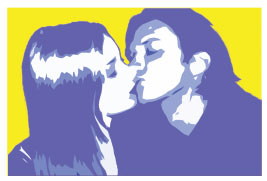
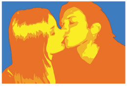
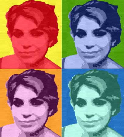
I have chosen to use one of my own photos. The picture shown right is a scaled down version of the end result I achieved.
At the end of this tutorial save the file to disc, take it down to your local print shop and get a large high-quality print. It will make a fantastic piece of Andy Warhol inspired art for your wall or a great gift! Let's get started...
a) Preparing the Photo
Open up your photograph/soon-to-be-masterpiece in Photoshop and duplicate the
background layer. Just click the layer called "Background" and
drag it to this icon ![]() at the bottom of the layer window to duplicate
the layer.
at the bottom of the layer window to duplicate
the layer.
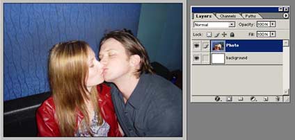 Rename this
new layer "Photo" or something similar.
Rename this
new layer "Photo" or something similar.
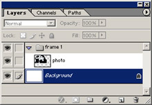
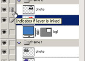
Create a new layer (![]() ). Make this new layer white. Drag it below
the "Photo" layer and rename it "background". You can
delete the original layer called "Background". Your layers
window should look like the one in the picture below.
). Make this new layer white. Drag it below
the "Photo" layer and rename it "background". You can
delete the original layer called "Background". Your layers
window should look like the one in the picture below.
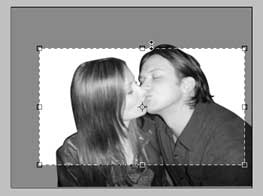
Now working on the "P 22122y2422w hoto" layer we need to clear out all the unwanted parts of the photograph. In this case I want to isolate the kissing couple and delete the rest i.e the background walls and sofa.
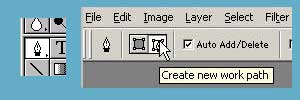 To cut out the couple I use the Pen Tool. Now
to some-up how to use Photoshop's pen tool in a few sentences isn't easy...if
you have never used the pen tool before, do the PEN TOOL TUTORIAL
first.
To cut out the couple I use the Pen Tool. Now
to some-up how to use Photoshop's pen tool in a few sentences isn't easy...if
you have never used the pen tool before, do the PEN TOOL TUTORIAL
first.
Remember to make sure the pen tool is set to create a Work Path. See below.
*NOTE: You could use the eraser tool but the results won't be as professional. Make Andy Warhol proud!
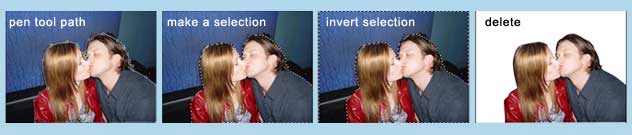
Take the pen tool create a path around the couple and then make it into selection. Invert the selection (CTRL + Shft + i) and hit delete.
 Desaturate the
photo (Ctrl + Shft + U) and Crop so that the photo has an interesting
composition.
Desaturate the
photo (Ctrl + Shft + U) and Crop so that the photo has an interesting
composition.
Adjust the Brightness/Contrast...
Image >> Adjustments >> Brightness/Contrast
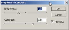
 Obviously the settings will be different for your
photograph. Just adjust the sliders until your photo becomes quite dramatic.
Now comes the fun part...
Obviously the settings will be different for your
photograph. Just adjust the sliders until your photo becomes quite dramatic.
Now comes the fun part...
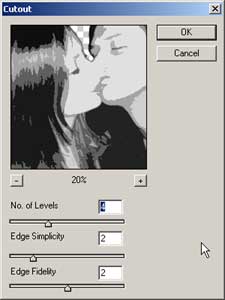
b) The Cutout Filter
Apply the Cutout Filter to the
"photo" layer with the settings approximately as shown below.
Filter >> Artistic >> Cutout...
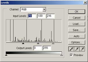 Adjust the Levels (Ctrl + L). You want to
adjust the sliders until your photo is black, roughly 3 shades of grey, and
white.
Adjust the Levels (Ctrl + L). You want to
adjust the sliders until your photo is black, roughly 3 shades of grey, and
white.
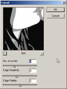 Now apply the cutout filter again. This time increasing
the edge simplicity. The idea behind this is really to abstract and simplify
the photo. Of course don't just use the numbers shown below, trying
experimenting!
Now apply the cutout filter again. This time increasing
the edge simplicity. The idea behind this is really to abstract and simplify
the photo. Of course don't just use the numbers shown below, trying
experimenting!
Adjust the levels again if you feel the urge. I like the look of 3 tone (white, black and grey). Below is my image.
Don't forget to Save
 Now let's organise the canvas and create an Andy
Warhol inspired layout.
Now let's organise the canvas and create an Andy
Warhol inspired layout.
Step 2: The Repetition Layout
Preparing the Canvas
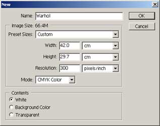
Open up a new canvas (Ctrl +N) with the settings shown below. The size is A3 (landscape)...you could make it bigger or smaller, but A3 is a good size poster/print, especially if you get it framed. We use 300 dpi for the best quality print . Plus make sure the mode is set to CMYK if you intend to print it. Click OK
 Now go back to your original canvas. Click on your
"photo" layer and drag and drop it onto you new "Warhol"
canvas.
Now go back to your original canvas. Click on your
"photo" layer and drag and drop it onto you new "Warhol"
canvas.
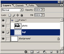
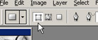
Put the "photo" layer into a set. To create a new set, simply
click this icon (![]() ) at the bottom of the layers window. Place the layer into a set by click
dragging them onto the set. Rename the set appropiately e.g "frame
1". Your layers window should now look like the image shown below.
) at the bottom of the layers window. Place the layer into a set by click
dragging them onto the set. Rename the set appropiately e.g "frame
1". Your layers window should now look like the image shown below.
Create a new layer and rename e.g "bg1". Make sure it is in the "frame 1" set and below the "photo" layer. See the following image.
 Working on the "bg1" layer take the Rectangle
Tool (
Working on the "bg1" layer take the Rectangle
Tool (![]() )
and drag a rectangle to the size of the "photo" layer. Make sure the
mode is set to Shape Layers before you draw the rectangle!!!! Lots of
people make the mistake of checking this!! See image below.
)
and drag a rectangle to the size of the "photo" layer. Make sure the
mode is set to Shape Layers before you draw the rectangle!!!! Lots of
people make the mistake of checking this!! See image below.
The image below shows you how your work area should look now. Don't worry about the size of the "photo" and "bg1" layers, we are about to adjust that.
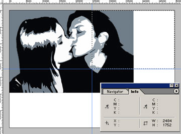
Make sure your Rulers are on (Ctrl + R), and drag two guides to divide up the canvas into 4 sections. Take your time and get it exact. See below.
*TIP: Make sure SNAP TO GUIDES is on and use the rectangular marquee with the INFO WINDOW to measure distances.
Now click on your "frame 1 " set in your layers window. We are going to transform the two layers of this set.
Edit >> Transform >> Scale
Hold down Shft as you scale up or down so that pic maintains it's correct proportions. You want to achieve something like the picture below. See how the bottom-right corner rests in the centre of the canvas. Press Enter to complete the scaling.
Right click on the "frame 1" set and select Duplicate Layer Set.... Do this 2 more times so you have a total of 4 sets.
Rename all your sets to "frame 2", "frame 3", and "frame 4".
Now move all the sets into the right positions. If you hold down Shft as you drag the sets, it contrains the movement to only vertical or horizontal...very handy!
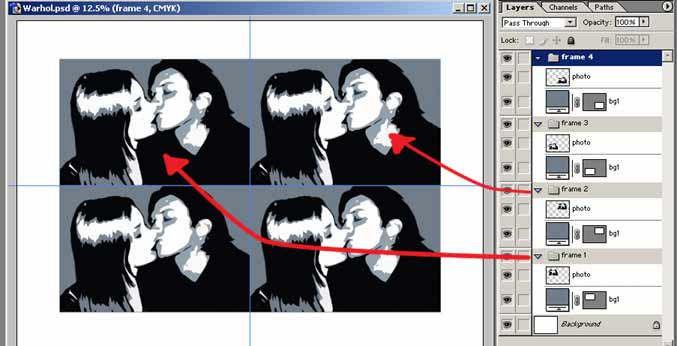
Right so now your work area should look like the image above. Almost there!
Actually now might be a good time to remind you to Save.
Use the move tool and the keyboard arrow keys to move the sets apart a little and get the composition just right.
 STEP 3: The Color Warhol Poster
 The second half of this tutorial should be relatively
fast...provided you can decide on the right colour combinations!
The second half of this tutorial should be relatively
fast...provided you can decide on the right colour combinations!
Someone once asked Andy Warhol...
"What are the right colours? How do you know which are right?"
Andy Warhol's reply...
"Well I don't know, after you finish it you know what's right."
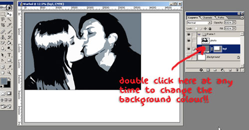
Adding the Color
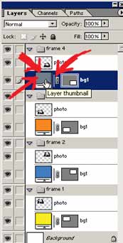
 Change the "bg1" color for each set by
double clicking on the Layer Thumbnail as shown below. Select a colour
from the Color Picker window that pops up and then click OK.
Change the "bg1" color for each set by
double clicking on the Layer Thumbnail as shown below. Select a colour
from the Color Picker window that pops up and then click OK.
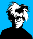
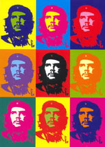
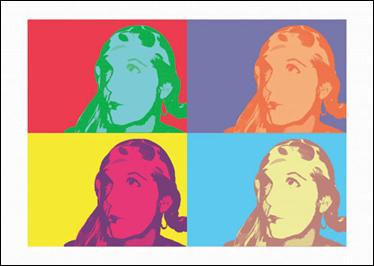
Not sure what color to use? Use the Andy Warhol picture below as a guide.
Now to add color to the people. There are two methods here so you can experiment around a little to see what you like best.
Method 1
Create a new layer in the "frame 1" set and
rename it "pc". (That stands for people color, 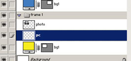 not very imaginative). Place this layer between the
two existing layers. See below picture.
not very imaginative). Place this layer between the
two existing layers. See below picture.
 Now holding down Ctrl click on the layer
"photo" in the Layers Window. You will see a little dashed-line
square appear on the cursor hand. See image below.
Now holding down Ctrl click on the layer
"photo" in the Layers Window. You will see a little dashed-line
square appear on the cursor hand. See image below.
Look at the canvas and you will find the "photo" subject/s perfectly selected. Now still working on the "pc" layer, grab the paint bucket tool and fill the selection with you a vibrant color.
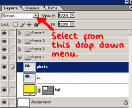 Now click on the "photo" layer and change
the mode to Screen. See images below. That's method 1 done
Now click on the "photo" layer and change
the mode to Screen. See images below. That's method 1 done
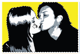
 The result I achieved with method 1...
Method 2
 Working on the "frame 2" set now, complete
method 1. However this time we are going to take it a little further.
Working on the "frame 2" set now, complete
method 1. However this time we are going to take it a little further.
Link the "photo" layer and the "pc" layer. See image below.
Now merge these linked layers (Ctrl + E).
Layer >> Merge Linked
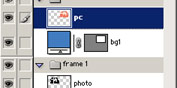
Create a new layer and rename it "pc 2". Place this layer on top of "pc 1" layer
 Ctrl click on the "p1" layer to perfectly
select the image again. Fill the "pc 2" layer with a vibrant color.
Ctrl click on the "p1" layer to perfectly
select the image again. Fill the "pc 2" layer with a vibrant color.
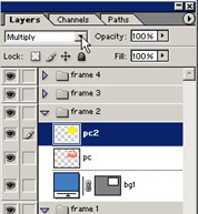
Now set the mode of the "pc 2" layer to Multiply. Your layers window should look like mine shown below.
The result I achieved with method 2...
NOW EXPERIMENT! Try different color combinations. Try different modes. Try linking all the layers in one set together and merging THEN adjusting the Hue/Saturation...(Ctrl + U) on the layers.
Once you have completed all 4 sets and are happy with the result Save
STEP 4: The Finishing Touches
a) Adding a Signature
If you have a tablet, simply create a new layer above all the other layers and sign your name.
No tablet? Please don't write your signature with your mouse...it will probably just turn out a mess. DEFINITELY DON'T USE THE TEXT TOOL...that is not a signature!
Get piece of real white paper and do your signature with a black pen. Scan the signature. Click on the layer in the Layers Window and drag and drop it onto your Warhol canvas.
Move the signature into place and scale it to the right size.
Quite often with scans there will be some unwanted grey marks. What we want is nice black lines on a perfectly white background. You will probably need to Adjust the Curves...
Adjusting Curves
First make sure your image doesn't have any colour...
Image>>Adjust>>Desaturate...
 Then...
Image>>Adjust>>Curves...
The line in the "Curves" dialogue box will appear as a diagonal. Click on this diagonal line twice and drag these two markers until your line forms an "S" shape (as shown above). The lower marker will increase the black values as you pull it down. The upper marker will decrease the grey values as you pull it up. The exact shape of YOUR "S" curve will depend on YOUR signature image, so watch your image as you move these markers until you achieve the desired result.
Finally set the mode of the signature layer to Multiply.
Save your photoshop file. I called mine "warhol_unmerged.psd". This way I can also change the colors and make more interesting prints in the future.
b) Adding Canvas Texture
 Lots of print
shops can now print your photoshop files directly on to canvas which is really
cool but it is also expensive. If you can afford to do this stop here. Simply
flatten your image. Save the file to disc and go to the print shop.
Lots of print
shops can now print your photoshop files directly on to canvas which is really
cool but it is also expensive. If you can afford to do this stop here. Simply
flatten your image. Save the file to disc and go to the print shop.
Layer>>Flatten Image
If not try this...
We are going to apply a canvas grain effect to our picture, so it's going to look like a print from a canvas original...which I happen to like the look of. This step is optional, you may not like it. I think you should try though, to see what it turns out like.
Flatten your image.
Layer>>Flatten Image
Change the mode to RGB.
Filter>>Texture>>Texturizer...
The settings I used are shown in the image below but have a play round for yourself! Remember the keyword is SUBTLE!
Change the mode back to CMYK.
Save. I called this file "warhol_merged.psd"
Off to the printer you go!
So that's it! That's how to change you photos into
Andy Warhol inspired masterpieces. I hope you found this Photoshop tutorial
helpful. Feel free to contact
me via my contact page if you have any questions.
On the following page is some amazing results that others have had following my
Pop Art tutorial.
LOVE YOUR WORK!
From time to time people send me pictures of their work that they have achieved through following my tutorials. I decided to put some of the best here ...
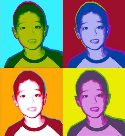
By Sacha Hart, London 2005
By Paul Lindeboom, Amsterdam, Holland 2005
 Notice how
Paul left the whites of the eyes white...This gives a really nice effect!!
Notice how
Paul left the whites of the eyes white...This gives a really nice effect!!
Maybe try it on your Warhol-inspired picture!

By Elise Grandjean, Belgium 2005
By Tim Bunyard, Devon, UK 2006
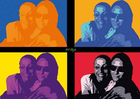
By Davide Vigna, Rome, Italy 2006
By Jeremy Kerr
2006
|