ALTE DOCUMENTE
|
|
In this tutorial, I describe various common graphic design elements in modern web ("2.0") design style.
I then attempt to explain why they work (i.e. why they have become common), as well as how, when and where you might use each element in your designs.
It follows on from my Current Style article, and analyses in greater depth the design features of the current "Web 2.0" design style.
The list below is a summary of many of the common features of typical "Web 2.0" sites.
Clearly, a site doesn't need to exhibit all these features to work well, and displaying these features doesn't make a design "2.0" - or good!
I've already addressed some of these factors in my introductory Current Style article.
Not all these design features are appropriate in all cases. There are always exceptions, and there are lots of bad examples of these features being used wrongly, over-used, or done without sensitivity to the "symphony" of a site's design.
You can't just take all these elements, throw them together and make a good web page, any more than you can take some eggs, sugar, flour and throw them together and get a cake.
Making a web page that works requires a lot of sensitivity to the various forces at work. A good design solution is one that balances those (often opposing) for 11211w2220l ces.
I'm using the term "Web 2.0 design" to describe the prevailing style of web design I introduce in my current style article.
Many people use the term "Web 2.0" to describe:
Many others also use the term in reference to a recent school of web design. I'm comfortable with using it in that context here.
In sociological terms, movements impact people on many levels: economic, cultural, political, etc. Is skate-punk about entertainment and sport, music and the music industry, fashion, or the breakdown of society?
I'm going to take you through the features of the current wave of excellent web site designs, dissect the most significant features, explain why each one can be good, and show you how to use them in your own sites.
If I had to sum up "Web 2.0" design in one word, it would have to be "simplicity", so that's where we'll start.
I'm a great believer in simplicity. I think it's the way forward for web design.
Today's simple, bold, elegant page designs deliver more with less:
"Use as few features as are necessary to achieve what you need to achieve"
Web design is simpler than ever, and that's a good thing.
2.0 design means focused, clean and simple.
That doesn't necessarily mean minimalist, as I'll explain later.
I really believe in simplicity. That's not to say that all web sites should be minimal, but that we should use as few features as are necessary to achieve what you need to achieve.
I've written elsewhere about Occam's Razor, which is a principle I use all the time. One way of interpreting it is: Given any two possible solutions to a problem, the simpler one is better.
Here are some examples. Note how unnecessary elements have been stripped out from each. There could be a lot more on each page than there is... but would that make them stronger?
The result is that you have to look at the content. You find yourself interacting with exactly the screen features the designer intended. And you don't mind - it's easy, and you get just what you came for.


Always!
There are two important aspects to achieving success with simplicity:
"It seems that perfection is reached not when there is nothing left to add, but when there is nothing left to take away."
Antoine de Saint-Exupéry,
Terre des hommes, 1939
Whenever you're designing, take it as a discipline consciously to remove all unnecessary visual elements.
Concentrate particularly on areas of the layout that are less relevant to the purpose of a page, because visual activity in these areas will distract attention from the key content and navigation.
Use visual detail - whether lines, words, shapes, colour - to communicate the relevant information, not just to decorate.
Here's an example of a design that suffers from not enough simplicity.
Yaxay's interface uses a lot of pixels, but the vast majority of them are decorative, part of the page background. Relatively few pixels are used to user to find or understand information or interact with the site.
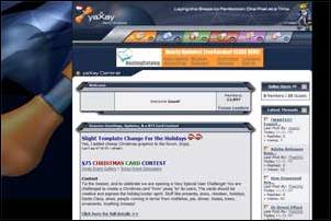

See how much "stuff" there is to look at, and notice how few of the pixels are used to clarify actual navigation, actual content, or actual interactive features.
Edward Tufte is the boss when it comes to the design of information. He uses the terms "data ink" (i.e. detail that enables information transfer) and "non-data ink" (i.e. detail that's just detail) to describe this phenomenon.
One way Tufte specifically measures the effectiveness of information design (graphs, charts, presentations etc.) is using the ratio of data-ink to non-data-ink. The higher the proportion of data-ink used, the more likely it is that a design is effective.
Taking the Yaxay detail above, there's a lot of what I call "busyness", i.e. a lot of edges, tonal changes, colour variations, shapes, lines... a lot of stuff to look at. But, in this detail, the only useful features are:
All the rest of the "busyness": the shapes in the background, the diagonal lines in the interface panel, the grid, the gradients... all this is noise, it's all "non-data ink", because it's not enabling communication.
Simplicity means:
Use as many pixels as you need, in whatever way you need, to facilitate the communication that needs to happen.
Of course, often what you're communicating isn't hard data, but soft information.
Hard data
means facts, like news, stock prices, train times, or how much money is in your bank account...
Soft information
covers the qualitative aspects of communication, like the first impression about the quality of a company, the sense of how approachable a service provider is, and whether you feel a product will be right for you. It can be just as important!
Whether what you're communicating is hard or soft, your pixels count, so use them consciously and with care.
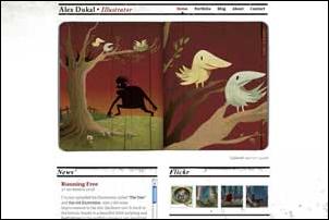
Take the example below:
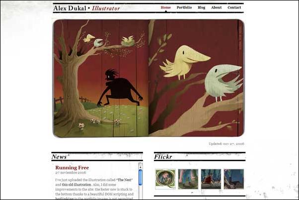
Alex Dukal's site is rich, interesting and appealing. It uses a range of visual techniques to draw your attention, make you interested and to give you a warm feeling about the quality of Alex's work.
But it's also simple, because it uses its pixels/ink/busyness with care and sensitivity. It's not gratuitous, it's economical and rich.
Whatever you're saying, choose wisely where you use your ink/pixels. Use it to communicate, first and foremost. Then, ask whether you can communicate just as effectively with less. If so, do it.
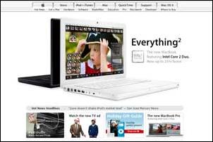
(More about this on the Current Style page). Basically, the vast majority of sites these days are positioned centrally within the browser window. Relatively few are full-screen (liquid) or left-aligned / fixed-size, compared to a few years ago.
This "2.0" style is simple, bold and honest. Sites that sit straight front & center feel more simple, bold and honest.
Also, because we're being more economical with our pixels (and content), we're not as pressurised to cram as much information as possible above the waterline/fold.
We're using less to say more, so we can be a bit more free and easy with the amount of space used, and pad out our content with lots of lovely white space.
I'd say, position your site centrally unless there's a really good reason not to.
You may be wanting to get more creative with the space, or get as much information on-screen as possible (for example with a web app).
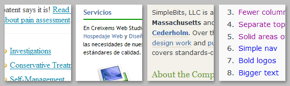
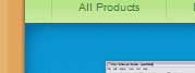
A few years ago, 3-column sites were the norm, and 4-column sites weren't uncommon. Today, 2 is more common, and 3 is the mainstream maximum.
 Why using fewer columns is good
Less is more. Fewer columns feels simpler, bolder, and more honest. We're communicating less information more clearly.
There's also a by-product of the domination of centered layouts. Because we're not filling the whole screen so much, and not trying to get as much on-screen at any one time, we simply don't need as many columns of information.
37Signals have always been at the front when it comes to questioning the status quo and coming up with simple answers.
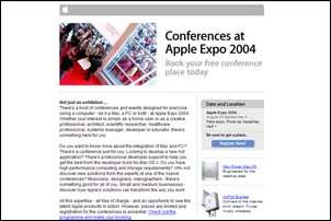 Here,
they use 2 columns. This a great case study in simplicity. It lets the message
speak, and adds nothing that could get in the way.
Here,
they use 2 columns. This a great case study in simplicity. It lets the message
speak, and adds nothing that could get in the way.
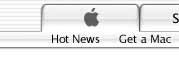
Apple is the other leader in elegant simplicity.
This kind of layout works really, really well. Each time I experience Apple's simple design, the more convinced I become that its zen approach is the holy grail of design.
This typical Apple layout shows that someone has honestly asked, "How many boxes/columns/lines do we really need?". Then they've boldly edited out unnecessary elements, and the result is undeniably the cleanest, most effective communication.
 I'd definitely recommend using no more than 3 columns, simply because
you should use no more of anything than you need to.
I'd definitely recommend using no more than 3 columns, simply because
you should use no more of anything than you need to.
There are always exceptions, so here are a few examples of more than 3 columns used effectively.
Derek Powazek's blog site uses 3 columns for the main section of his blog, but 4 lower down.
The lower section is a kind of pick & mix, where the abundance of columns emphasises the "Take what you like" feel.
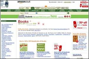
Amazon (UK) has two side columns, and products arranged centrally in 3 additional columns.
It works beacuse the purpose of each column is clear from its design. The left col is definitely navigation; the right column is "other stuff". The products in the middle are clearly tiled and separated by white space, so they don't overwhelm.
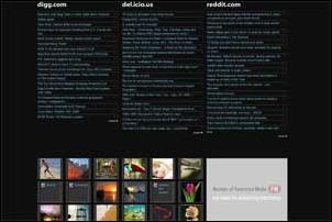
Popurls.com contains loads of pick-n-mix information, collating the hot links from other sites like digg and del.icio.us, but it still keeps to 3 columns for the main blocks of text.
Further down, it shows thumbnails of popular images on the photo-sharing site Flickr (and there are Youtube vids later). These are tiled in several columns, which is fine, because it's a sit-back, scan and pick your experience moment...
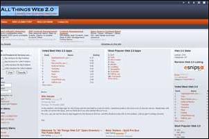 And here's a site that gets it wrong...
 Here's All Things Web2.0 using 4 columns: 2 side columns and 2 central columns.
The downside of this layout is that you don't know where to start looking. Everything is somehow low-priority (partly because of the darkish background).
As we saw, Amazon differentiates the page to this extent, but the design helps you instantly identify what each area of screen real-estate is for, so it's not confusing.
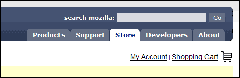
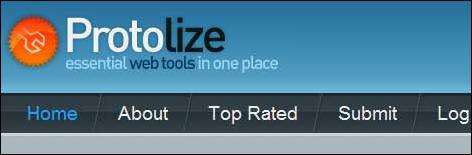
This means making the top of the screen (the main branding & nav area) distinct from the rest (the main content).
Of course, there's nothing new about this approach. It's a good idea, and has been used for ever. But it's being used more than ever now, and the distinction is often stronger.
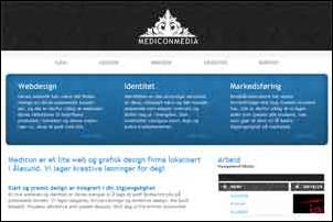
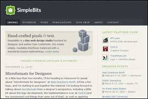
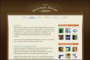
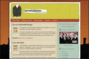
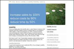
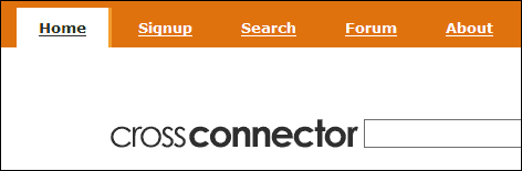
See how clear the "page-tops" are in these 6 samples, even at small scale:
The top section says "Here's the top of the page". Sounds obvious, but it feels good to know clearly where the page starts.
It also starts the site/page experience with a strong, bold statement. This is very "2.0"-spirited. We like strong, simple, bold attitude.
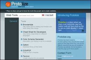
2 of these top-sections contain just branding (Protolize, Mediconmedia), 1 has just navigation (Cross Connector), and the remaining 3 have both.
The weakness of Cross Connector, in my view, is that the logo comes after the nav. I prefer the nav to be high-up, and clear (like e.g. Simple Bits).
On any site, both the main branding and main navigation should be obvious, bold and clear.
So it's a good idea to create a clear space at the top of a web site design that positions the logo and nav boldly.
Always put your logo right up the top of the screen. I'd always recommend putting your main navigation right after it.
It's definitely a good thing to mark the top of the page with a section that marks out the high-level screen features as separate from the main site content.
The top section should be visually distinct from the rest of the page content. The strongest way to differentiate is to use a bold, solid block of different colour or tone, but there are alternatives.
Here are 2 examples where the top section is separated with a solid line, rather than being solid colour itself.


And here, the top section contents simply sit boldly outside the main column area.

Leading on from the clearly differentiated top area, you'll notice that lots of sites define the various areas of real-estate boldly and clearly.
Real estate comes in various forms, including:
It's possible to design a web page so that these areas are immediately distinct from their neighbours.
The strongest way to do this is using colour.


But white space can be just as effective.
The risk with strong colour is that it draws the eye, so it can take attention away from other relevant screen elements.
I think that placing clean content on white space creates an easier experience, helping the viewer to feel more relaxed and free to browse.
Permanent navigation - your global site nav that appears on every page as part of the page template - needs to be clearly identifiable as navigation, and should be easy to interpret, target and select.

Users need to be able to identify navigation, which tells them various important information:
Following the principle of simplicity, and general reduction of noise, the best ways to clarify navigation are:
Simply remember the key: navigation should be clearly distinguishable from non-navigation.
Just follow the guidelines above, regarding differentiation through position, colour and clarity.
Inline hyperlinks should also stand out sufficiently from the text around them.
Check out these snippets. In each case, you're in do doubt what's a link. (Personally, I prefer using blue text (non-underlined) which turns to underlined red on hover...)
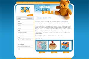
A clear, bold, strong brand - incorporating attitude, tone of voice, and first impression - is helped by a bold logo.
Here are some (100% scale). Notice that logos are tending to be quite large, in line with the general 2.0 principles.
Strong, bold logos say "This is who we are." in a way that we can believe.
See my articles on logos and text-based logos.
It's very hard to say how to create a good logo, but in brief...
Your logo should:
Lots of "2.0" web sites have big text, compared to older-style sites.
If you fill the same amount of space with less "stuff", you have more room.
When you've made more room, you can choose to make more important elements bigger than less important elements (if they're still there).
Making things bigger makes them more noticeable then lesser elements. This effect has been used throughout the history of print design, on headings, title pages and headlines.
Not only does big text stand out, but it's also more accessible to more people. That's not just people with visual impairments, but also people looking on LCD screens in sunlight, people sitting a little further from the screen, and people just skimming the page. If you think about it, that could be quite a lot of people!

Big text makes most pages more usable for more people, so it's a good thing.
Of course, size is relative. You can't take a normal, busy site, make ALL the text bigger, and make it more usable. That might not work, that might be worse.
In order to use big text, you have to make room by simplifying, removing unnecessary elements.
You also need to haave a reason to make some text bigger than other text. And the text must be meaningful and useful. There's no point adding some big text just because it's oh-so 2.0!
If you need to have a lot of information on a page, and it's all relatively equal in importance, then maybe you can keep it all small.
Leading on from the big text theme, many sites lead with strong all-text headline descriptions.
These normally set out the site's USP, elevator pitch or main message.
They tend to be graphical, rather than regular text. The reason for this is that designers want a lot of control over the page's visual impact, especially early on in a browsing experience.

Only use one if you've got something bold to say.
If you have a simple message that you want to be seen first, go ahead and headline it. Make it clear by putting it against a relatively plain background.
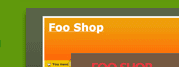
Bright, strong colours draw the eye. Use them to divide the page into clear sections, and to highlight important elements.
When you have a simple, stripped-out design, you can use a bit of intense colour to help differentiate areas of real-estate and to draw attention to items you want the visitor to notice.
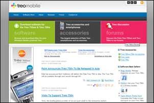
The Treo Mobile site uses 3 areas of strong colour to mark out and advertise 3 main areas of the site.
The background colour makes it clear that this isn't main content, and large, bold title text helps you see quickly what's in each one, so you can decide whether it interests you.
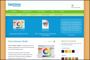
Colorschemer sections the page with bands of intense, bright, cheerful colour, set against a more neutral background.
Apple's design has always used a great balanced combination of tone (darks), rich effects and colour to draw the eye.
It may be the most perfectly designed web site there is, in my opinion.
In this image, the intense dark areas and strong colour are used sparingly to pick out important content.
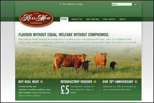 Here,
the colour isn't bright, but it is strong, partly because of the amount of
green used.
Here,
the colour isn't bright, but it is strong, partly because of the amount of
green used.
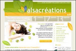
This design uses green to communicate the values of "quality" and "health".
 Note: site design doesn't match this image!
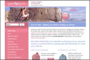
This site sells outdoor clothes exclusively for females, and the soft colours reinforce the chosen brand personality.
A nice, effective page design is compromised by the use of large areas of intense colour outside the main page area.
The
result is that the eye is drawn away from the real content.
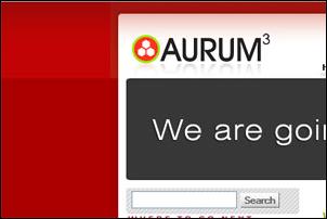
The Aurum Newtech site risks the same effect, but the colour is just pale enough to keep the content noticeable.
Also, the big, bold and well-spaced content elements help draw attention away from the "attractive" background.
If you're using strong colours to attract the eye, it only works if there's lots of area that isn't strongly coloured.
If everything is trying to attract the eye, then the eye just gets confused, and the site will feel confusing and chaotic.
Most 2.0-style sites use subtle 3D effects, sparingly, to enhance the qualitative feel of the design.
We all know that these little touches just feel nice, but we may not know why.
Realistic surface affects like drop-shadows, gradients and reflections help make a visual interface feel more real, solid and "finished".
They may also remind us of certain tactile or aesthetic qualities of real-world objects, such as water droplets, shiny plastic buttons, and marble floors.


The golden rule here is to use with care, and not to overdo it.
As I explain in the tutorial on 3D Effects, these effects should not be applied to everything.
Like any of these techniques, a rich surface may add value to your design when used sensitively and appropriately.
If your navigation/icon/logo/layout sucks fundamentally, you can't polish your way out. Get the fundamentals right first.
It can also be important to maintain a consistent light-source. Although this can get more complex with the illusion of back-lit diffusion in buttons etc., you still know whether an overall design feels consistent.
3D effects can also make elements seem to stand out from the page, but only if the rest of the page is relatively flat.
Avoid trying to make your entire design 3D-realistic because:
Web 2.0 design has more gradients than the Alps.
Gradients soften areas that would otherwise be flat colour/tone.
They can create the illusion of a non-flat surface, used to good effect on Alex Dukal's portfolio.
Gradients can be used to fade a colour into a lighter or darker tone, which can help create mood.
In page backgrounds, they may also create an illusion of distance.
A common gradient combo is blue-to-white, which evokes the effect of aerial perspective, creating the sense that the background fades away towards the horizon.
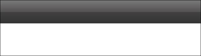
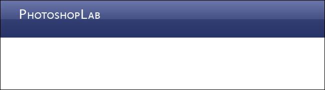
They are commonly used at the very top of page backgrounds, where they help denote the boundary of the viewable area.
They're also an integral part of drop-shadows, and the inner-glows and specular highlights you see on glass- or plastic-style buttons.
Note that gradients usually work best when juxtaposed with areas of flat colour or tone.
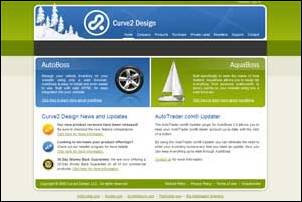
On the Curve2 homepage, the
gradients are more effective because each one is positioned adjacent to a flat
white or grey section.
It's common to find gradients enhancing the base colour (using mix effects like color-burn or overlay in Photoshop), which create subtly different hues.
Here, the highlighted green colour is warmer and friendlier than the darker base colour. The overall effect is both softer and richer.
The illusion of reflection is one of the most common applications on gradients.
These commonly come in 2 kinds:
Realistic effects of water droplets, glass beads, shiny plastic buttons etc. have been very popular over the past couple of years.
I don't know where the trends started, but Apple's web site must have been one of the most influential, preceding their Aqua interface look & feel.
Here are some examples:
The classic Apple.com shiny
plastic tabs, still in use today.
These use highlights caused by a light source above the tabs, combined with an inner, diffuse glow that creates the plastic effect.
These tabs, from one
of my recent redesigns, have a polished (from the strong white highlight) carbon-fibre
appearance. The carbon effect comes from the warm diagonal-stroke pattern from
the icon's glow.
More nice shiny plastic. Notice how the reflections fall off at the edge of the shape, which create the illusion of rounded edges.
Similar effect on a
square shape looks like a badge.
The non-horizontal angle creates a sense of dynamism.

This shiny button from cafepress.com uses a rounded reflection that suggests a wide light source coming off a rounded surface.
This button from web hosts Mediatemple has a more diffuse reflection, suggesting a matt glass finish.
Pioneered by Apple again (I'm sure). This is a really nice effect which is so prevalent now, it's in danger of being overused, now starting to look tired and is falling out of favour with designers.
Remember, of course, that web designers are usually more sensitive to these things, so even if we're getting turned off by it, the general public may still think it's cool for some time to come.

The standard Apple look. Greyed-out and fading on a white base.
On a coloured background
Fading out to either side (my one this, not published yet)
More extreme angle, and a rich layered effect reflecting the colour of the solid object
Here's how to do it (from photoshoplab.com) »
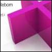
The reflective or glass effect was first popularized by Apple. There have been many tutorials about creating Apple's "Aqua Buttons" and this is a similar effect.
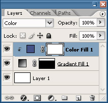
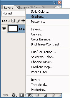 After making your
selection, create a new Gradient Fill Layer Layer > New Fill Layer > Gradient... or use the Fill Layer button at the bottom of your Layers palette.
After making your
selection, create a new Gradient Fill Layer Layer > New Fill Layer > Gradient... or use the Fill Layer button at the bottom of your Layers palette.
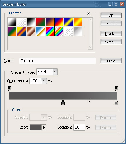
Click on the Gradient to bring up the Gradient Editor. Select the "Foreground to Background" preset from the list of presets. Click on the first Stop on the left and set the Location to 50%. Then set the color to something a little darker than your base color. I'm going to use greys because it leaves me some flexibility for changing the color later.
Create another Stop to the left of the gradient and set the Location to 49%. Set the color to something slighter darker than the 50% Stop. Create another Stop at Location 0% and make it slightly darker than the Stop at 49%.
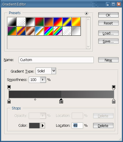
Press OK and you now have your gradient.
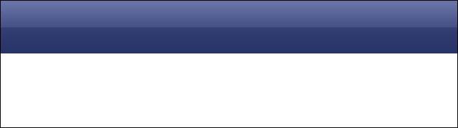
 To add some color,
create a new Solid Color Fill Layer Layer > New Fill Layer > Solid Color... or, again, use the button at the bottom of the Layers palette and
select a color for the gradient. Press Command + Option + G or Layer > Create Clipping Mask to create a clipping mask of your new layer. Scroll through the Layer
Modes Shift + - until you find one that you like.
To add some color,
create a new Solid Color Fill Layer Layer > New Fill Layer > Solid Color... or, again, use the button at the bottom of the Layers palette and
select a color for the gradient. Press Command + Option + G or Layer > Create Clipping Mask to create a clipping mask of your new layer. Scroll through the Layer
Modes Shift + - until you find one that you like.
Reflections have become a huge trend for website design lately. We'll first start by selectin the Type Tool T and entering the type we want to reflect.
 Duplicate that text
layer by pressing Command +
J. Drag the duplicated layer below your original in
the Layers Palette. Right click on the duplicate layer in the palette and
choose Rasterize Type
Duplicate that text
layer by pressing Command +
J. Drag the duplicated layer below your original in
the Layers Palette. Right click on the duplicate layer in the palette and
choose Rasterize Type
With the duplicate layer chosen in the Layers Palette, press Command + T to bring up the Free Transform. Right click in the transform binding box and choose Flip Vertical. Drag your flipped layer so that the bottoms match.
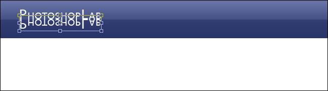
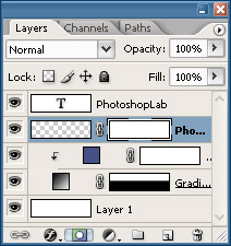 Add a Layer Mask by
click on the button at the bottom of the Layers Palette or by going Layer > Layer Mask > Reveal All
Add a Layer Mask by
click on the button at the bottom of the Layers Palette or by going Layer > Layer Mask > Reveal All
Press D to reset your colors and then press G to select the Gradient Tool. With the layer mask selected in the Layers Palette, which it should be already, drag from top-to-bottom with the Gradient Tool until you get the fade you desire.

You now have your type reflection. You can use the same method for any object also.
Another popular effect is the soft shadow. It's actually more of a glow than a shadow, so we will approach creating the effect this way.
 Select the layer of
the object you want to add the shadow to, in my case it's the gradient layer I
created before, and click on the Add New Layer Style button (at the bottom of
the Layers Palette) and choose Outer
Glow
Select the layer of
the object you want to add the shadow to, in my case it's the gradient layer I
created before, and click on the Add New Layer Style button (at the bottom of
the Layers Palette) and choose Outer
Glow
Set the Blend Mode to Normal;
Color to Black or ;
Size to something like , and
Opacity to
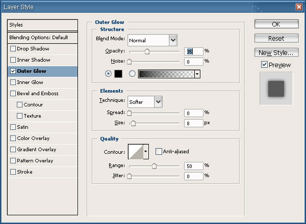
You will now have a soft shadow that should look similar to this:

Icons play an important role in Web 2.0 design. Today we use fewer, better icons that carry more meaning.
Icons can be useful when they're easily recognisable and carry a clear meaning. In lots of other cases, a simple word is more effective.
In the old days, icons were sometimes overused. It seemed that everyone wanted an icon for every navigation link or tab. Now, we use clear text more extensively, and are less ready to litter a page with icons.
Where 2.0 designers do employ icons, they are reserved for higher-value spots, where .
Simpler, more spacious designs demand less attention and allow for a richer icons.
Some examples, demonstrating various attributes.


Do not necessarily have to feature tiny hills!
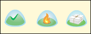


Creatively inspired by Mac OSX. See Enhanced Labs for a great showcase.


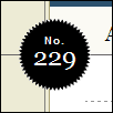
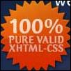
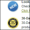
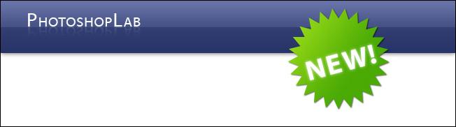
These are the star-shaped labels that you see stuck on web pages, alerting you to something important.
They work by evoking price stickers in low-cost stores. For this reason, they suit the start-up ethic of many 2.0 sites, but for the same reason may cheapen other sites.
They can really work well, but of course should only be used to draw attention to something important.
I'd recommend only using one on a page (at most!).
Another style that's seeming over-used, and will probably run its course over the next year.


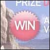

 Another trend popping
up is the star shapes or violator (thanks comment-er) for getting attention.
Another trend popping
up is the star shapes or violator (thanks comment-er) for getting attention.
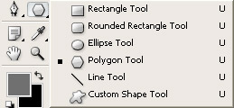
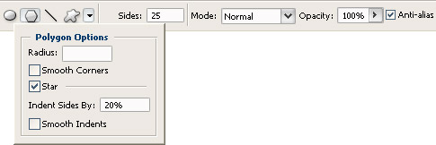
Click and hold on the Shape Tool until the sub-menu opens and choose the Polygon Tool.
Create a new Solid Color Fill Layer and choose whatever color you want your shape to be. Press D then Command + Backspace to fill the layer mask with black.
Up in the Options Bar, click on the down-facing arrow to bring up your Shape Options. For my shape I checked the Star checkbox on and set the Indent Sides By to . In the Options Bar I checked Anti-alias on and set the Sides to
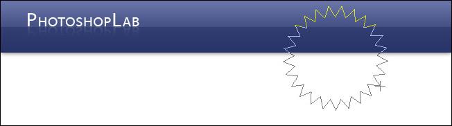
Now I'm ready to draw out my star:
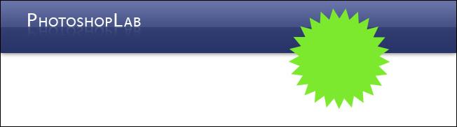
To style it a little more, I used a Gradient Fill Layer instead of a solid color and I added a tight Drop Shadow Layer Style, settings: Opacity , Distance 1px and Size 2px
In the next installment of this 2-part series, I will show you how to create diagonal line patterns, rounded corners and some other Web 2.0 effects.
There are a lot of websites out there that use some sort of variation of a diagonal pattern. One of them being this website (look up) and a few other sites. The hardest part of this is creating the actual pattern.
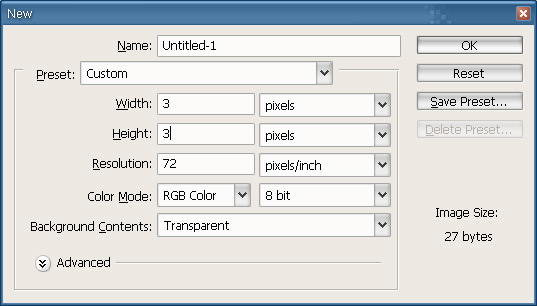
The first thing you'll want to do is create a new document by going to File > New or pressing Ctrl + N. When the New Document dialog opens, set the Background Contents to Transparent. The dimensions settings will depend on the size of the line you want to create and the amount of space between the lines. For this first example I'll just be using 1-pixel wide lines spaced 1-pixel apart, so my dimensions will only have to be 3px x 3px.
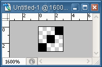
Since my document is so tiny I'm going to zoom in as close as possible, 1600%, by pressing Ctrl + =. Using the Pencil Tool with a Brush Size of 1, I'll draw three dots in a diagonal.
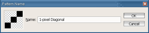
Select All by pressing Ctrl + A and go to Edit > Define Pattern.... You can then name your pattern in the Pattern Name dialog box.
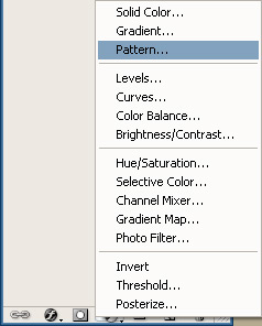 Your new
pattern is now ready to use. Create a new Pattern Fill Layer by going Layer > New Fill Layer > Pattern or by using the button on the bottom of the Layers palette.
Your new
pattern is now ready to use. Create a new Pattern Fill Layer by going Layer > New Fill Layer > Pattern or by using the button on the bottom of the Layers palette.
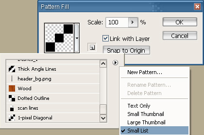
You can click on the down arrow next to the current pattern, if your new one isn't selected, to find your pattern. Click on the small right-facing arrow and choose "Small List" to see the names of your patterns.
Press OK to finish the new Pattern Fill layer. You'll now have your diagonal pattern.
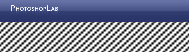
It's pretty ugly right now, so I'm going to drop the Opacity of the new layer to around

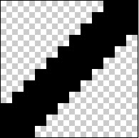
To create a thicker line pattern we'll have to determine our size and spacing then create a new layer. I'm going for 4-pixels wide spaced 4-pixels apart, so I'll create a new document Ctrl + N 12px x 12px. Select the Line Tool and set the options in the Options bar to Fill pixels, Weight 4px, and Anti-alias unchecked.
Draw your line diagonally holding the Shift key to make sure it's completely diagonal. Then zoom in really close again.
Select the Square Marquee tool M and draw a 7px x 7px square and drag the corner to the line like shown:
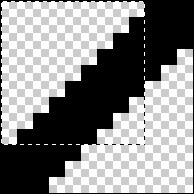
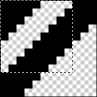
Press Ctrl + J to duplicate the selection onto its own new layer. Drag that new layer to the corner. Then make another square selection starting in the corner like shown:
That selection is going to be the new pattern, so, go to Edit > Define Pattern and follow the steps from before.
Rounded corners are nothing new in web design. It became trendy then died down a little bit, I think, because it's hard to program for (I'm a web developer), but with some new solutions popping up, they're becoming easier to deal with.
This method will show you how to create smooth rounded corners that can be fine-tuned. A little more flexible and technical than just going Select > Modify > Smooth or using the Rounded Rectangle Shape tool.
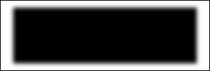
 Starting
with a square or rectangle selection, create a new Solid Color (or Gradient)
Fill Layer, making sure your selection is smaller than your canvas.
Starting
with a square or rectangle selection, create a new Solid Color (or Gradient)
Fill Layer, making sure your selection is smaller than your canvas.
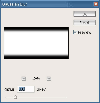
Now we'll add a small Gaussian Blur by going Filter > Blur > Gaussian Blur. Setting the blur higher will make a more rounded corner; lower setting for a smaller corner. A good average is usually 3.0 pixels
Now we can use two methods to finish our corners, Curves or Levels, so I'll show you both. Personally, I like using Curves, so I'll show you that method first.
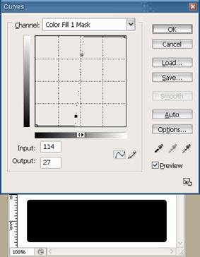
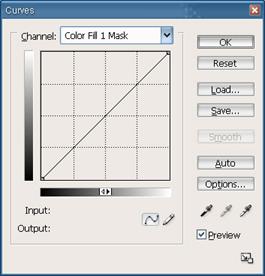 Bring up
the Curves dialog box by pressing Ctrl + M
Bring up
the Curves dialog box by pressing Ctrl + M
Click on the Curves line to create an adjustment point. Add a point to the upper end of the line and drag it towards the middle. Do the same with the lower end of the line. Adjust the points until you see your blur start to sharpen and your rounded corners appear. Use the image below for reference.
 You now
have rounded corners.
You now
have rounded corners.
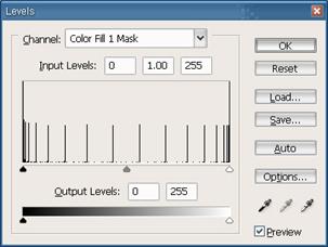
To use the Levels method, bring up the Levels dialog box by pressing Ctrl + L
 Drag the
two side sliders towards the middle and you'll see the blur disappearing and
the rounded corners starting to show.
Drag the
two side sliders towards the middle and you'll see the blur disappearing and
the rounded corners starting to show.
 With a
little experimenting and a combination of these techniques, you can make your
website design a little more modern and (maybe) a little more trendy.
With a
little experimenting and a combination of these techniques, you can make your
website design a little more modern and (maybe) a little more trendy.
Thanks and enjoy!
|
