WeditRes
A Resource editor
Jacob Navia
Logiciels/Informatique
Note: The ressource editor is now integrated into Wedit. Nothing that is here has changed, and the changes are noted in the text.
Designing your dialog boxes under Windows
Generate the 'C' code that is necessary for them to run.
This two operations can be separated. You can use the resource editor for just drawing your resources, and you will take care of the programming sied, writing of the callback functions, etc. This is a possibility for instance, when you have already a mass of code that uses this approach, and you do not feel like modifying it to fit into the resource editor schema of things.
Draw it. Weditres helps you by giving you a drag and drop interface. You just place the objects in their respective positions.
Generate the different files that containg information about it (Save it)
Compile and link the generated sources with your program.
Test it.
This manual will explain you this operations in detail. To give you an overview of the process, here we summarize all those steps.
Step 1. Drawing the dialog box. You drop the controls from the toolbar in the place they will occupy in the dialog box. This operation is explained in detail in the first chapter.
Step 2. Saving it. Weditres saves the information in a special type of files with the extension .wed. This file contains the information Weditres needs that is not contained in a normal windows ressource file. The windows information is saved in two files : the .dlg, and the .res. Those files contain information that allows Windows to display your dialog box at runtime. In addition to those, Weditres generates a .c and a .h source files. Those are linked with your program, and implement all the user interface characteristics at runtime, that you defined when drawing the dialog box.
Step 3. You compile and link the generated sources with the callback procedures for your dialog box.
Step 4. You test...
Example :
You make the dialog called IDD_MYDLG, in the project called 'myprj'. If you do not change the default file names, you will obtain the following files :
myprj.dlg. This file contains the ascii description of the resources used, to be compiled using lcc-win32 resource compiler 'lrc'.
myprj.res This file contains the binary description of the resources. This file can be directly used by the linker to add your resources into the executable. This saves you the compilation step.
myprj.h. This file contains the symbolic definitions of the symbols you used in the dialog, so that you can use them in your C programs.
You can have many dialog boxes and other resources in your program. Since weditres only edits the dialog boxes, it is important, when you needed it, to organize things into an .rc file, that will contain all other resource files, and the descriptions of all resources not handled by weditres.
This file, for the above example would contain just the following lines :
#include <windows.h>
#include myprj.h
#include myprj.dlg
The first line is mandatory. All the ASCII descriptions of resources use the symbolic names defined in windows.h, instead of the raw numerical values.
The second one instructs the resource compiler to include the definitions you made when designing the dialog box. You gave a symbolic name to each element you want to access in your dialog box, so this file, that contains all of them, should be included too.
The third line, instructs the resource compiler to read the dialog definitions from the indicated file.
You can separate all your dialogs, and store each one of them in a spearate dialog box file and header if you wish. In that fashion, each editing project remains of reasonable size.
Or you can throw all your dialogs into one big file, so you avoid cluttering your directory with too many files. This is a matter of taste left to you.
Weditres generates a dialog box procedure in a c file. this procedure contains the actions to take when each of the windows messages that you have decided to handle arrives at your dialog.
The structure of this procedure is verey simple : it is just a big 'switch' statement, containing a case for each of the messages that interested you.
BOOL DialogDlgProc(HWND hwnd,UINT msg,UINT wParam,UINT lParam)
return(HandleDefaultMessages(hwnd,msg,wParam,lParam)) ;
The unhandled messages go to the default dialog box procedure of weditres. This procedure is described later, and treats all messages and takes default actions for some. Its code is located in weditreslib.lib, that you should include in your project link libraries. The source code is available too, so you can modify it as you wish.
Normally, you are interested in taking some action when a message arrives, and this can't be generated by weditres. It is your task. Here we meet the 'callback' functions.
Each of those callback functions will be called by the dialog procedure when a message for which you showed interest arrives. Those callback functions receive different parameters, that allow them to access to the other controls of the dialog, or to take any other action.
The last piece that is missing from this puzzle, is how do you start all this happening. This is very easy. You use the DialogBox, or the DialogBoxParams function, to associate a resource with a procedure that will handle the messages.
This is done using the DialogBox windows primitive :
The DialogBox function creates a modal dialog box from a dialog box template resource. DialogBox does not return control until the specified callback function terminates the modal dialog box by calling the EndDialog function. Its prototype looks like this :
int DialogBox(HANDLE hInstance,
LPCTSTR lpTemplate,
HWND hWndParent,
DLGPROC lpDialogFunc ) ;
hInstance Identifies an instance of the module whose executable file contains the dialog box template.
lpTemplate Identifies the dialog box template. This parameter is either the pointer to a null-terminated character string that specifies the name of the dialog box template or an integer value that specifies the resource identifier of the dialog box template. If the parameter specifies a resource identifier, its high-order word must be zero and its low-order word must contain the identifier. You can use the MAKEINTRESOURCE macro to create this value.
Normally, all your resources are defined using a symbolic name, i.e. a #define that amounts to an integer. Weditres does not support named dialog boxes very well, and in any case, that is really wasteful of space in your executable.
hWndParent Identifies the window that owns the dialog box. Normally, this is the main window of your application, but of course you can use any other window.
lpDialogFunc Points to the dialog box procedure. For more information about the dialog box procedure, see the DialogProc callback function.
Return Value If the function succeeds, the return value is the nResult parameter in the call to the EndDialog function used to terminate the dialog box.If the function fails, the return value is -1.
In the normal case you would just call then :
DialogBox(hInst,MAKEINTRESOURCE(IDD_MYDLG),hwndMain,MyDlgFunc) ;
The system loads the indicated resource dialog from the executable, and starts sending it messages. The first message, that its sent is WM_INITDLG, followed by a WM_SIZE. This messages are received when the dialog box is not yet visible in the screen. Here you can initialize things.
The function 'MyDlgFunc' is generated by weditres, and it starts receiving those messages. When a message that you marked as interesting arrives, the procedure that you indicated in the 'Callbacks' field of the control/dialog will receive control, and you can treat the message as you wish.
The principle of operation for building the dialogs is simple : You have a toolbar with all the controls supported by weditres. You pick up one type of control (a button, a group box, etc) and you drop it at the position you want, within the surface of the dialog box.
You access to the parameters of the selected control by typing Ctrl+Y, or just double clicking in the surface of the control. Personally, typing Ctrl+Y is better, because a double click could slightly move the control from its position.
There is a different dialog box for each type of control. In those dialog boxes you define the identity (symbolic #define) and numerical value that you want for each control. This is not necessary for all controls, only for those you want to access from your program. Of course you could write
GetDlgItem(hwnd,476) ;
but it is much clearer if you write
GetDlgItem(hwnd,IDVALIDATE_BUTTON) ;
In the parameters dialog boxes you determine in general the following things :
The identity of the control, as shown above.You can change the symbolic name given by default, or its numeric value. To use an already existing identifier you open the identity combo box, and select an item from the list of available identifiers. Do not type an old name directly, because of a small bug I haven't foudnd the time to correct. Only type a name in there when its a new name, not used before.
The static style of the control, i.e. the different options that windows gives for modifying the appearence of the control, or some other properties.
The dynamic style. This is implemented by C code generated by weditres, that allows you to change some characteristics of the dynamic behaviour or appearence that waren't provided by the windows system.
The messages and actions you want to be aware 14414j914o of. Weditres will intercept the messages you indicate, and generate code that will code the function you specify. That function is usually indicated in a 'Callbacks' edit field, in each dialog box. You can type any name you want, but it is better to prefix it with the name of the dialog box, so that there isn't any name conflict between the functions that make similar actions in different dialog boxes.
You go into the 'File' option of the menu, choose new, enter 'example' as the name of the project, and then OK.
Weditres will startup a dialog box, and give you a complicated dialog box with several dozens of parameters. You ignore all of them except the 'Callbacks' field, and enter there the prefix for all the functions in this new dialog box : DlgExample.
Then, press the 'ok' button and the dialog box will disappear, leaving you an empty dialog box. Drag one button from the toolbar to the dialog box.
The 'Button' icon is labelled 'ok', so it is fairly easy to recognize it. If you leave the mouse a small time over each button, an explicative text appears, telling you what control is described by the icon.
Put the button somewhere in the dialog box, then double click on it. You will see a slightly less complicated dialog box open, and you will ignore all parameters, BUT the 'Callbacks' edit field. You will type in there : DlgExampleButtonAction.
Save your work. With an editor, open the file example.c, generated by weditres. You will see following code :
/* Wedit Res Info */
#include <windows.h>
#include « example.h »
BOOL APIENTRY DlgExample(HWND hwnd,UINT msg,
WPARAM wParam,LPARAM lParam) /* Standard paramaters of a callback function */
break ;
}
return(HandleDefaultMessages(hwnd,msg,wParam,lParam)) ;
This message, is the first one that this procedure receives. Weditres does here some initializations, needed later for its internal workings. We ignore this.
The procedure 'DlgExampleInit', is called by the code generated by weditres. This procedure should initialize what needs to be initialized in this dialog box. This procedure should be written by YOU, since you are the one that knows what this dialog box will do, and what things need to be stored where.
The message WM_COMMAND is one of the most popular window messages. Most of the messages sent by the controls when an event occurs reach this part of the code.
DlgExampleButtonAction is again an example of a callback. This is a procedure that should be written by you, and should do whatever you think is necessary when the 'action' button is pushed.
DLG_0100 DIALOG 6, 18, 180, 180 (1)
STYLE DS_MODALFRAME | WS_POPUP | WS_VISIBLE | WS_CAPTION | WS_SYSMENU (2)
CAPTION « Dialog Title » (3)
FONT 8, « Helv » (4)
PUSHBUTTON « Push », 101, 52, 65, 40, 14 (5)
The dialog has the name DLG_0100 since we didn't change the default name. You should put more meaningful names here. The coordinates in dialog box units follow.
The style of the dialog is the default style : visible, caption, system menu, and modal frame. This are the static styles.
The text of the caption follows.
The font name and point size follow.
We have only one control : a push button, with its default text. Again, the coordinates of the control follow in dialog box units.
We can write a simple .rc file to be used with the resource compiler. Here it is :
#include <windows.h>
#include « example.h »
#include « example.dlg »
You can then compile this with the symple command line directive :
lrc example.rc
This is not necessary, since weditres generated too an example.res resource file that can be directly used by the linker.
You can set the margins, and other things using the 'Config' menu item in the 'Resources' menu of Wedit.
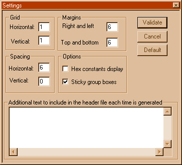
The grid is the minimung spacing between each movement. The spacing is the amount of space left by the editor by default between controls. The margins, are just that : margins that delimit the controls from the borders of the window.
'Sticky group boxes' means that the controls that are enclosed by a group box are moved with the group box when you move it. If you deselect this feature, to move all items in a group box you have to select all of them.
You can include additional text in the header file that the resource editor generates. This text can be entered here.
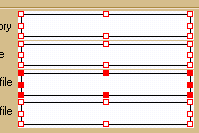
There is always a selected item. It is highlited with eight small red squares. You can change its hsape by taking one of the squares with the mouse, or, if you prefer using the Ctrl+Arrow keys : Ctrl+left arrow is equivalent to taking the square in the left border of the control and moving it leftwards.
To select several items, you click in the controls you want to select and maintain the Shift key pressed.
When several items are selected, you can align them using the dominant control as the guide. The dominant control has all its squares full, in contrast to the others, that have empty squares around them.
To align controls, use the fixed toolbar at the top of weditres. This toolbar contains bitmaps for aligning several controls in all possible positions.
You can use the clipboard to cut and paste dialog items from one dialog box to the other.
The clipboard works as always with the currently selected items.
To start the control, just press the
'test' button, or press Ctrl+T. This will make weditres create a copy of the
control, and load that copy as windows would do. You can see the appearence of
the control in action, press buttons, select list box items, etc. Pressing the
OK button, or the Cancel button will stop the test. If the dialog box has a
close menu, pressing that button will stop the test too.
If you have painted yourself in a corner, by drawing a dialog box without all those buttons, you can always get out by pressing Ctrl+T again, what will stop the test.
When you press the 'dir' button, you will see a list of all the dialog boxes that are contained in the current project in a separate window. Using the right mouse button, you can sort the items in several ways : by ID, or by title or others.
The tab key can be used to switch the focus from one element of the list box to the following one in the Group order that you choose at design time. Normally, this order is the sequence that you used when dropping the controls in the dialog surface one after the other. You can change this order by using the 'Group' item in the 'Options' menu bar.
This order is important for the ergonomy of your dialog box, specially for people that do not like to leave the hands from the keyboard, and prefer just using the tab key to go to the next entry field for instance, instead of using lengthy mouse move operations.
The 'Group' dialog box will show you the list of controls that you have already dropped in your dialog box. You select one item, and then you can easily move it around to put it first or after another control. Here you can set/unset whether the control will be a tab stop or not. If you unset the tabs, the tab key will never go into that control. This is recommended for controls that do not accept any user input, like static text fields or group boxes.
And this is all there is to it Of course, there are hundreds of details that will be explained later,if I arrive at bringing myself to writing all the documentation... But the essential of weditres is this.
To control which files will be generated, and where they will be written, you should use the 'Files' menu item in the 'Files config' contextual menu. This menu can be shown at any time if you press the right mouse button somewhere in the surface of the weditres edit window.
The dialog box that appears allows you to individually select/deselect which files will be generated, and to change the paths where they will be generated. It is not a bad idea to look at this place if you have any problems with paths, or similar.

The options are the following:
The framework file. This is a C source file that is generated by the resource editor that contains a dialog box procedure for each dialog box defined. Only if this option is active you will see in all properties dialog boxes the corresponding dynamic options.
The header file. This file should be always generated since it contains all the definitions of the integer constants in your resources.
The binary resource file. This is a file that can be passed directly to the linker.
The .rc ascii definitions file. This file will be generated if you started the resource editor with a .rc file. It contains the definitions of all the resources.
The .dlg file. This is an ascii file that contains the resources definitions for your dialog boxes only.
The .wed file contains the definitions of the dynamic properties of the dialog boxes or resource that you have designed.
User callbacks file. The name of the file where you stored the procedures that are going to be called from the dialog box procedures. This is optional.
Additional include files. Files that will be included too in your resource files. You can leave this field empty.
Dictionary. This is not implemented fully yet.
Include files for bitmaps etc. The resource editor will start the resource compiler telling it to include these directories in the search.

The group and the tab order are essential for a good user interface. The tab order is the sequence that the focus of the controls in the dialog will follow when the user presses the TAB key. Normally, the TAB key should go from one control to its immediate neighbor, without jumping around.
The dialog editor will establish this sequence as just the order that you used to drop the controls in the dialog. It often happens, however, that you drop a control, and then you realize that you forgot one, and drop another control in a wholly unrelated place. This doesn't affect your dialog box visually, but it does affect the user interface. Pressing the TAB key will make the focus jump around within the controls of your dialog box.
Besides, it is important, that static controls like group boxes or text fields aren't available with the TAB key. If they acquire the focus, they do not show it, so the user doesn't know where the focus is.
You can change the tab order by moving the controls around within this dialog box. To move a control you select it first, by clicking in the middle of a row.
When a control is selected, you will see that the form of the mouse changes to an horizontal bar when moving within the list of controls. This means that you can drop the control in that position, and change its order.
The controls that are reachable with the TAB key have a small tab symbol at the left of them.
You should remove that tab stop from Group boxes, static text fields, and other static controls. You should add it to all controls that receive user input like buttons, edit fields, list boxes, etc.
You can set/unset this property with the corresponding buttons at the right side of the controls list.
You can set the 'GROUP' property to any control, that will become a group separator for a number of controls that are logically related.
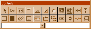
The floating toolbar of the editor allows
you to choose a control and to drop it into the dialog box.
The different buttons are :
This cancels the selection.
This represents a static text control.
This represents an edit control, both
single line (default) or a multiline edit control.
This represents a group box.
This represents a push button.
This represents a check box.
This represents a radio button.
This represents a combo box.
This represents a list box.
This two buttons represent a scroll
control, either horizontal or vertical.
This two buttons represent a static rectangle, either empty or filled.
This represents an icon control.
This represents a month calendar control.
This represents a list view control. If you use this, please do not forget to call InitCommonControls in your code. This applies to all other controls after this one.
This represents a tab control.
This represents a tree view control.
This represent a progress control.
This represents a spin button.
This represents a slider control.
This represents an AVI displaying
control. This is not operational in this version of weditres.
The two comboboxes allow you to edit the
symbolic name of the currently selected control at the left, and to edit the
control's text at the right, if applicable.
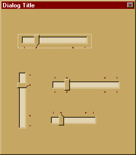
The selected control will be shown with full red handles around it. By holding the Shift key down and clicking in other controls, you can select several of them :
Here we have four controls selected. The dominant control has the full red handles. The others are the
controls that will be resized or aligned using the dominant control as the
guide, and are shown with hollow red handles. For instance, if you select
several controls and then press the align left button in the fixed toolbar of
the editor,  the
controls will be aligned using the left side of the dominant control. If you
choose the 'same width' button in the fixed toolbar,
the
controls will be aligned using the left side of the dominant control. If you
choose the 'same width' button in the fixed toolbar,  the
dominant control's width will be used to resize all other controls in the
selection.
the
dominant control's width will be used to resize all other controls in the
selection.
The multiple selection doesn't apply to the dialog box itself of course, since there is no meaningful alignment that can be used with the dialog box itself.
The selection is important when copying controls from one dialog box to the other, since the normal operations like cut, paste, and copy apply to the selected controls. This allows you to easily transport controls from one dialog to another.
The arrow keys apply to the selection too : you can move the group of selected controls using the arrows, what is more precise than using the mouse.
When there is only one control selected, you can resize the selected control using the Ctrl+arrow keys. The combination Ctrl+left arrow, for instance, will maintain fixed the right side of the control, and resize it towards the left. The right arrow with the control key does the same but to the right, the up arrow resizes it towards the top of the screen, and the down arrow towards the bottom of the screen.
Using the  tool, you can fix a control, or one side of a
control to the screen. This allows you to move it horizontally or vertically
without fear of disturbing the overall position, or to fix it in one place
within the dialog box, so that you do not move accidentally later.
tool, you can fix a control, or one side of a
control to the screen. This allows you to move it horizontally or vertically
without fear of disturbing the overall position, or to fix it in one place
within the dialog box, so that you do not move accidentally later.
When you click in the tool, the mouse changes its shape, signifying that you can fix the selected control. This will not work when you have the entire dialog box selected, since fixing a dialog box is not very sinful.
You should click in one of the red handles of the selected control. The color of the handle will change, telling you that side of the control is now fixed. For instance :
 will change
to :
will change
to :  , meaning
the right side of the control is now fixed. This means that the control will
move along the vertical axis only. This allows you to move this control easily
with the mouse without fear that you move it to the left or right.
, meaning
the right side of the control is now fixed. This means that the control will
move along the vertical axis only. This allows you to move this control easily
with the mouse without fear that you move it to the left or right.
To exit from the 'fixing' mode, just click anywhere far away from the selected control in the screen.
To unfix a fixed control you just select the fixing tool again, and click in a blue handle. This acts as a toggle, unfixing the control.
The status bar is divided into five fields. They show in dialog coordinates :
The upper left corner of the selected control(s).
The lower right corner of the selected control(s).
The width (dx).
The height (dy).
The id of the control.
You can use the status bar to fine tune the position. By double clicking in the corresponding field of the status bar you can enter the positions numerically. When you double click in the 'dx' field of the status bar, you can change the width of the selected control and enter a numerical value directly.
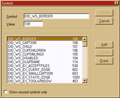
The purpose of this dialog is to allow you to add a new symbol, to erase a definition you no longuer need, or to change either the name or the value of a symbol.
To add a new symbol type its name in the first entry field, then the value it should have in the second, and press the Add button.
To erase a symbol select one in the list and press the Erase button.
To change a symbol change either its name or value, and then press the Change button.
The changes you do will be effective only after you press the validate button.
Easy isn't it ? No big science here.
Applications use dialog boxes to prompt for additional information for commands that require user input. Using a dialog box is the only recommended way for an application to retrieve the input.
Normally the dialog box is created, used, and destroyed. When the dialog box is visible, the main window of the program is inactive. This type of dialog boxes is called modal dialogs.
Many applications also use dialog boxes to display information or options while the user works in another window. For example, word processing applications often use a dialog box with a text-search command. While the application searches for the text, the dialog box remains on the screen. The user can then return to the dialog box and search for the same word again ; or the user can change the entry in the dialog box and search for a new word. Applications that use dialog boxes in this way typically create one when the user chooses a command and continue to display it for as long as the application runs or until the user explicitly closes the dialog box. This are the modeless dialog boxes.
Modal dialog boxes are simpler to manage than modeless dialog boxes because they are created, perform their task, and are destroyed by calling a single function.
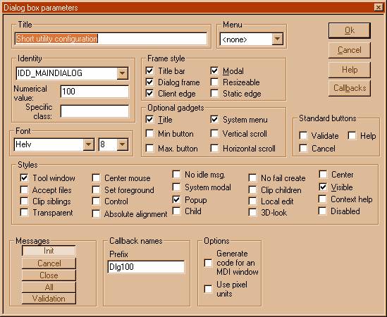
Note that if you are editing a .res file, and you haven't defined a project for weditres, only a portion of this dialog will be visible.
This text will be shown in the title bar of the dialog. You can enter any text here.
The #define under which this dialog box will be used in your application. This is the define you use when you call the DialogBox function. The numerical value is shown too, below. In the 'Specific class' entry, you can enter a specific class that you want to use for this dialog. This is normally left blank. In case you want to use another window class than the usual one, please be sure that your class is registered before invoking the dialog.
Name and size of the font used for this dialog.
|
Button |
Style |
Effect |
|
Title |
WS_CAPTION |
Shows a dialog box title |
|
Min button |
WS_MINIMIZE |
Minimize control in titlebar |
|
Max button |
WS_MAXIMIZE |
Maximize button in titlebar |
|
System menu |
WS_SYSMENU |
System menu |
|
Vertical/horizontal scroll |
WS_HSCROLL/WS_VSCROLL |
Scroll bars. Normally never used |
This allows you to add the standard button 'OK', 'Cancel', and 'Help' to the dialog box automatically.
Just press the ones you want to be added.
|
Button |
Style |
Effect |
|
Tool window |
WS_EX_TOOLWINDOW |
A tool window has a title bar that is shorter than a normal title bar, and the window title is drawn using a smaller font. A tool window does not appear in the task bar or in the window that appears when the user presses ALT+TAB |
|
Accept files |
WS_EX_ACCEPTFILES |
Specifies that a window created with this style accepts drag-and-drop files. |
|
Clip siblings |
WS_CLIPSIBLINGS |
Clips child windows relative to each other ; that is, when a particular child window receives a paint message, the WS_CLIPSIBLINGS style clips all other overlapped child windows out of the region of the child window to be updated. (If WS_CLIPSIBLINGS is not given and child windows overlap, when you draw within the client area of a child window, it is possible to draw within the client area of a neighboring child window.) For use with the WS_CHILD style only. |
|
Transparent |
WS_EX_TRANSPARENT |
Specifies that a window created with this style is to be transparent. That is, any windows that are beneath the window are not obscured by the window. A window created with this style receives WM_PAINT messages only after all sibling windows beneath it have been updated. |
|
Center mouse |
DS_CENTERMOUSE |
Centers the mouse cursor in the dialog box. |
|
Set foreground |
DS_SETFOREGROUND |
This style brings the dialog box to the foreground. Internally, Windows calls the SetForegroundWindow function for the dialog box. |
|
Control |
DS_CONTROL |
Creates a dialog box that works well as a child window of another dialog box, much like a page in a property sheet. This style allows the user to tab among the control windows of a child dialog box, use its accelerator keys, and so on. |
|
Absolute alignment |
DS_ABSALIGN |
Indicates that the coordinates of the dialog box are screen coordinates ; otherwise, Windows assumes they are client coordinates. |
|
No idle msg. |
DS_NOIDLEMSG |
Suppresses WM_ENTERIDLE messages that Windows would otherwise send to the owner of the dialog box while the dialog box is displayed. |
|
System modal |
DS_SYSMODAL |
Creates a system-modal dialog box. This style causes the dialog box to have the WS_EX_TOPMOST style, but otherwise has no effect on the dialog box or the behavior of other windows in the system when the dialog box is displayed. |
|
Popup |
WS_POPUP |
Creates a dialog that has the WS_POPUP bit on. Normally this is the default. |
|
Child |
WS_CHILD |
Creates a dialog that has the WS_CHILD window style. Normally this is not desired. The dialog box can't leave the boundaries of its mother window. |
|
No fail create |
DS_NOFAILCREATE |
Creates the dialog box even if errors occur ¾ for example, if a child window cannot be created or if the system cannot create a special data segment for an edit control. |
|
Clip children |
WS_CLIPCHILDREN |
Avoids drawing in child windows |
|
Local edit |
DS_LOCALEDIT |
Applies to 16-bit applications only. This style directs edit controls in the dialog box to allocate memory from the application's data segment. Otherwise, edit controls allocate storage from a global memory object. Somehow this button has resisted the port from 16 bit weditres... |
|
3D look |
DS_3DLOOK |
This style is required only by Win32-based applications compiled for versions of Windows earlier than Windows 95 or Windows NT 4.0. The system automatically applies the three-dimensional look to dialog boxes created by applications compiled for current versions of Windows. |
|
Center |
DS_CENTER |
Centers the dialog box in the working area ; that is, the area not obscured by the tray. |
|
Visible |
WS_VISIBLE |
Show the dialog when it starts |
|
Context help |
DS_CONTEXTHELP |
Includes a question mark in the title bar of the dialog box. When the user clicks the question mark, the cursor changes to a question mark with a pointer. If the user then clicks a control in the dialog box, the control receives a WM_HELP message. The control should pass the message to the dialog procedure, which should call the WinHelp function using the HELP_WM_HELP command. The Help application displays a pop-up window that typically contains help for the control.Note that DS_CONTEXTHELP is just a placeholder. When the dialog box is created, the system checks for DS_CONTEXTHELP and, if it is there, adds WS_EX_CONTEXTHELP to the extended style of the dialog box. WS_EX_CONTEXTHELP cannot be used with the WS_MAXIMIZEBOX or WS_MINIMIZEBOX styles. |
|
Disabled |
WS_DISABLED |
Creates a window that is disabled at startup. |
|
Message |
Effect |
|
Init |
Calls the specified callback function when the message WM_INITDLG is received. The name of the callback is DlgXXXInit(HWND hwnd, WPARAM wParam, LPARAM lParam) Normally, you should handle this message, since it allows you to initialize things in the dialog box before is displayed. |
|
Cancel |
Calls the specified callback function when the user presses the 'Cancel' button. The name of the callback is : DlgXXXCancel |
|
Close |
Calls the specified callback when the dialog receives the WM_CLOSE message. Its name is : DlgXXXClose. |
|
All |
Instead of calling the default message handling function, it calls a callback : DlgXXXDefault(HWND hwnd,UINT msg,WPARAM wParam,LPARAM lParam) ; This is an escape hatch so that you can always treat a message the framework doesn't consider |
|
Validation |
Calls DlgXXXValidate(HWND hwnd) when the user presses theOK button. |
The properties are described in the following dialog box :
The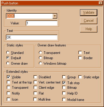
fields are:
|
Button |
Style |
Effect |
|
Standard |
BS_PUSHBUTTON |
Creates a normal push button |
|
Default |
BS_DEFPUSHBUTTON |
Creates a default push button |
|
Owner draw |
BS_OWNERDRAW |
Creates an owner draw pushbutton |
|
Transparent |
WS_EX_TRANSPARENT |
Transparent button |
|
Bitmap |
Not implemented | |
|
Windows bitmap |
Not implemented | |
|
Visible |
WS_VISIBLE |
Button is shown at startup |
|
Disabled |
WS_DISABLED |
Disabled at startup |
|
Vert center of text |
Centers the text vertically rather than horizontally |
|
|
Client edge |
WS_EX_CLIENTEDGE |
Client edge |
|
Flat |
BS_FLAT |
A flat button |
|
Multi line |
BS_MULTILINE |
Text will contain several lines |
|
Group |
WS_GROUP |
Button introduces a group of controls |
|
Tab stop |
WS_TABSTOP |
Button can be reached with the tab key |
|
Static edge |
WS_EX_STATICEDGE |
Button with a style that signifies that it doesn't accept user input. A strange style for a button. |
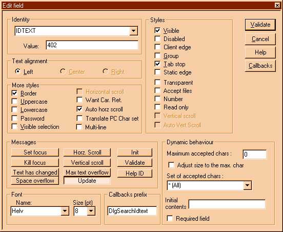
An edit field is selected and receives the input focus when a user clicks the mouse inside it or presses the TAB key. After it is selected, the edit control displays its text (if any) and a flashing caret that indicates the insertion point. The user can then enter text, move the insertion point, or select text to be moved or deleted by using the keyboard or the mouse.
|
|
Note that if you are editing a .res file, and you haven't defined a project for weditres, only a portion of this dialog will be visible.
You should establish here the general appearance of the edit field, and the prefix that will be used by weditres when generating the callbacks you want for this control. You can change the font, if you wish, the number of accepted characters, and set the initial contents of the edit field, if any.
The #define under which this edit field will be used in your application. This is the define you use when you call the GetDlgItem function for instance. The numerical value is shown too, below.
Text can be aligned from the left, centered, and from the right. Normally, use left alignment, other styles will provoke strange things when typing.
|
Button |
Style |
Effect |
|
Visible |
WS_VISIBLE |
The edit filed is visible when the dialog box is displayed |
|
Disabled |
WS_DISABLED |
The edit field is disabled (grayed) when the dialog box is displayed. You can change the text in it with SetDlgItemText, but the edit field doesn't respond to user input. |
|
Client edge |
WS_EX_CLIENTEDGE |
Specifies that a window has a 3D look-that is, a border with a sunken edge |
|
Group |
WS_GROUP |
Specifies the first control of a group of controls in which the user can move from one control to the next with the arrow keys. All controls defined with the WS_GROUP style after the first control belong to the same group. The next control with the WS_GROUP style ends the style group and starts the next group (that is, one group ends where the next begins). |
|
Tab stop |
WS_TABSTOP |
Specifies a control that can receive the keyboard focus when the user presses the TAB key. Pressing the TAB key changes the keyboard focus to the next control with the WS_TABSTOP style. |
|
Static edge |
WS_EX_STATICEDGE |
Creates a window with a three-dimensional border style intended to be used for items that do not accept user input. |
|
Transparent |
WS_EX_TRANSPARENT |
Specifies that a window created with this style is to be transparent. That is, any windows that are beneath the window are not obscured by the window. A window created with this style receives WM_PAINT messages only after all sibling windows beneath it have been updated. |
|
Accept files |
WS_EX_ACCEPTFILES |
Specifies that a window created with this style accepts drag-and-drop files. |
|
Number |
ES_NUMBER |
The edit field will only accept a positive number. A wrong character provokes a beep. |
|
Read only |
ES_READONLY |
Prevents the user from typing or editing text in the edit control. |
|
Vertical scroll |
WS_VSCROLL |
Vertical scrollbar. This is only allowed in multi line edit fields |
|
Horizontal scroll |
WS_HSCROLL |
Horizontal scrollbar. This is only allowed in multiline edit fields. |
|
Border |
WS_BORDER |
The edit field has a black border line around it. |
|
Uppercase |
ES_UPPERCASE |
Converts the characters to uppercase as they are typed in. |
|
Lowercase |
ES_LOWERCASE |
Converts the characters to lowercase as they are typed in. |
|
Password |
ES_PASSWORD |
Doesn't display the characters typed in. |
|
Visible selection |
ES_NOHIDESEL |
Negates the default behavior for an edit control. The default behavior hides the selection when the control loses the input focus and inverts the selection when the control receives the input focus. If you specify ES_NOHIDESEL, the selected text is inverted, even if the control does not have the focus. |
|
Horizontal scroll |
WS_HSCROLL |
Has a horizontal scroll |
|
Want Car. return |
ES_WANTRETURN |
Specifies that a carriage return be inserted when the user presses the ENTER key while entering text into a multiline edit control in a dialog box. If you do not specify this style, pressing the ENTER key has the same effect as pressing the dialog box's default push button. This style has no effect on a single-line edit control. |
|
Auto hor. scroll |
Automatically scrolls text to the right by 10 characters when the user types a character at the end of the line. When the user presses the ENTER key, the control scrolls all text back to position zero. |
|
|
Translate PC char set. |
ES_OEMCHARSET |
Converts text entered in the edit control. The text is converted from the Windows character set to the OEM character set and then back to the Windows set. This ensures proper character conversion when the application calls the CharToOem function to convert a Windows string in the edit control to OEM characters. This style is most useful for edit controls that contain filenames. |
|
Multi-line |
ES_MULTILINE |
Designates a multiline edit control. The default is single-line edit control. When the multiline edit control is in a dialog box, the default response to pressing the ENTER key is to activate the default button. To use the ENTER key as a carriage return, use the ES_WANTRETURN style. When the multiline edit control is not in a dialog box and the ES_AUTOVSCROLL style is specified, the edit control shows as many lines as possible and scrolls vertically when the user presses the ENTER key. If you do not specify ES_AUTOVSCROLL, the edit control shows as many lines as possible and beeps if the user presses the ENTER key when no more lines can be displayed. If you specify the ES_AUTOHSCROLL style, the multiline edit control automatically scrolls horizontally when the caret goes past the right edge of the control. To start a new line, the user must press the ENTER key. If you do not specify ES_AUTOHSCROLL, the control automatically wraps words to the beginning of the next line when necessary. A new line is also started if the user presses the ENTER key. The window size determines the position of the word wrap. If the window size changes, the word wrapping position changes and the text is redisplayed. Multiline edit controls can have scroll bars. An edit control with scroll bars processes its own scroll bar messages. Note that edit controls without scroll bars scroll as described in the previous paragraphs and process any scroll messages sent by the parent window. |
|
Message |
Effect |
|
Set focus |
When the dialog box receives the EN_SETFOCUS message, the callback : DlgBoxXXXSetFocus(HWND hwnd, WPARAM wParam,LPARAM lParam) ; will be called. |
|
Kill focus |
When the dialog box receives the EN_KILLFOCUS message the callback : DlgBoxXXXEditFieldYYYKillFocus(HWND hwnd, WPARAM wParam,LPARAM lParam) ; will be called. Normally at this point you would check the contents of the dialog box for validity. It is sometimes better to do it immediately, without waiting for the user closing the dialog box. |
|
Text has changed |
When the dialog box receives the EN_CHANGE message from the control, the callback : DlgBoxXXXEditFieldYYYChanged(HWND hwnd, WPARAM wParam,LPARAM lParam) ; will be called. This allows you to follow the input character by character if you want it to. |
|
Space Overflow |
If the user has typed so much text that the edit field has no space for holding it, the message EN_ERRSPACE will be received. At this point, if you want it, the callback : DlgBoxXXXEditFieldYYYErrSpace(HWND hwnd, WPARAM wParam,LPARAM lParam) ; will be called. This allows you to react to that situation. It must be noted that this was very frequent under windows 3.1, but it is virtually impossible that this happens now. |
|
Horz Scroll |
If the user has clicked in the horizontal scroll, the dialog box will receive the EN_HSCROLL notification message from the control. You can react to this event. In this case the callback : DlgBoxXXXEditFieldYYYHorzScroll(HWND hwnd, WPARAM wParam,LPARAM lParam) ; will be called. |
|
Vert Scroll |
If the user has clicked in the horizontal scroll, the dialog box will receive the EN_VSCROLL notification message from the control. You can react to this event. In this case the callback : DlgBoxXXXEditFieldYYYVertScroll(HWND hwnd, WPARAM wParam,LPARAM lParam) ; will be called. |
|
Max text overflow |
This allows you to get called when the user types more text than the limit for the control. You can set this limit in the 'Max. accepted chars' field at the right of the properties dialog box. The callback has the form : DlgBoxXXXEditFieldYYYTextOverflow(HWND hwnd, WPARAM wParam,LPARAM lParam) ; will be called. |
|
Init |
You can get called at the initialization of the dialog box, to initialize things for this specific control. Normally this is not used. The callback has the form : DlgBoxXXXEditFieldYYYInit(HWND hwnd, WPARAM wParam,LPARAM lParam) ; |
|
Validate |
You can establish a callback specific for this control when the user presses the OK button. Normally this is not used, and you process all controls in the Validate message for the whole dialog box. DlgBoxXXXEditFieldYYYValidate(HWND hwnd, WPARAM wParam,LPARAM lParam) ; Note that the HWND parameter there is the hwnd of the edit field. |
A radio button consists of a round button and application-defined text, an icon, or a bitmap that indicates a choice the user can make by selecting the button. An application uses radio buttons in a group box to permit the user to choose from a set of related, but mutually exclusive options. For example, the application might present a group of radio buttons from which the user can select a format preference for text selected in the client area. The user could select a left-aligned, right-aligned, or centered format by selecting the corresponding radio button. Normally, the user can select only one option at a time from a set of radio buttons.
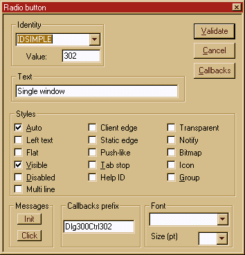
Note that if you are editing a .res file, and you haven't defined a project for weditres, only a portion of this dialog will be visible.
You should specify the prefix to be used for this control, and the font to be used.
This text will be shown in the radio button. You can enter any text here.
The #define under which this radio button will be used in your application. The numerical value is shown too, below.
Name and size of the font used for this radio button.
Only two messages need to be handled: Th 'Init' message, if you want a specific callback to be called at the initialization of the dialog box, and the 'Click' message, when the radio button has been activated. This message is not received when the radio button is deactivated, only when the transition is to the 'on' state. The callback is of the form:
DlgBoxXXXRadioBtnCliked(HWND hwnd, WPARAM wParam, LPARAM lParam) ;
|
Button text |
Style |
Effect |
|
Auto |
BS_AUTORADIOBUTTON |
Creates a button that is the same as a radio button, except that when the user selects it, Windows automatically sets the button's check state to checked and automatically sets the check state for all other buttons in the same group to unchecked. |
|
left text |
BS_LEFTTEXT |
Places text on the left side of the radio button or check box when combined with a radio button or check box style. |
|
Flat |
BS_FLAT |
The 3D appearence of the button is more flattened than a normal push button, but very similar. For an example see the radio buttons Init or Click in the dialog box at the beginning of this chapter. |
|
Visible |
WS_VISIBLE |
The radio button is visible at startup. |
|
Disabled |
WS_DISABLED |
The radio button is disabled at startup. |
|
Multi line |
BS_MULTILINE |
The text of the radio button can be wrapped into several lines of text. |
|
Client edge |
WS_EX_CLIENTEDGE |
Specifies that a window has a 3D look-that is, a border with a sunken edge |
|
Static edge |
WS_EX_STATICEDGE |
Creates a window with a three-dimensional border style intended to be used for items that do not accept user input. |
|
Push like |
The look of the radio button is very similar to a push button. It remains sunken when selected. |
|
|
Tab stop |
WS_TABSTOP |
The Tab key can be used to move into the control |
|
Help ID |
The button can answer the WM_HELP message. Not supported in this version. |
|
|
Transparent |
WS_EX_TRANSPARENT |
The button is transparent. Not really a good idea but who knows ? Maybe you find a use for it. |
|
Notify |
BS_NOTIFY |
Enables a button to send BN_DBLCLK, BN_KILLFOCUS, and BN_SETFOCUS notification messages to its parent window. Note that buttons send the BN_CLICKED notification message regardless of whether it has this style. Note that weditres doesn't handle this messages, so you should process them yourself within your default dialog box procedure. |
|
Bitmap |
The radio button holds a bitmap. Not supported in this version. |
|
|
Icon |
The radio button holds an icon.. Not suypported yet. |
|
|
Group |
WS_GROUP |
The radio button is a group separator. Not a good idea for a radio button that should be a member of a group of radio buttons. |
A text static control displays text in a rectangle in one of five styles: left-aligned without word-wrap, left aligned with word-wrap, centered, right-aligned, or « simple. »
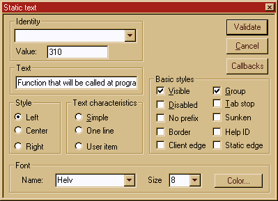
Note that if you are editing a .res file, and you haven't defined a project for weditres, only a portion of this dialog will be visible.
This text will be shown in the text field. You can enter any text here.
The #define under which this control will be used in your application. The numerical value is shown too, below.
Name and size of the font used for this control.
|
Button text |
Style |
Effect |
|
Left |
SS_LEFT |
Text left aligned |
|
Center |
SS_CENTER |
Text centered |
|
Right |
SS_RIGHT |
Text right aligned |
|
Simple |
SS_SIMPLE |
Specifies a simple rectangle and displays a single line of left-aligned text in the rectangle. The text line cannot be shortened or altered in any way. The control's parent window or dialog box must not process the WM_CTLCOLORSTATIC message. |
|
One line |
SS_LEFTNOWORDWRAP |
Specifies a simple rectangle and left-aligns the given text in the rectangle. Tabs are expanded but words are not wrapped. Text that extends past the end of a line is clipped. |
|
User item |
Obsolete Not longuer supported under windows 32. |
|
|
Visible |
WS_VISIBLE |
Text is visible at startup. |
|
Disabled |
WS_DISABLED |
Disabled at startup |
|
No prefix |
SS_NOPREFIX |
Prevents interpretation of any ampersand (&) characters in the control's text as accelerator prefix characters. These are displayed with the ampersand removed and the next character in the string underlined. This static control style may be included with any of the defined static controls. |
|
Border |
WS_BORDER |
The text field has a visible border. |
|
Client edge |
WS_EX_CLIENTEDGE |
Specifies that a window has a 3D look-that is, a border with a sunken edge |
|
Group |
WS_GROUP |
The text field signals a group of controls. |
|
Tab stop |
WS_TABSTOP |
The text field can be reached with the tab key. Normally this is not really good for a static control. |
|
Sunken |
SS_SUNKEN |
The text has a sunken appearence |
|
Help ID |
Not yet supported by weditres |
|
|
Static edge |
WS_EX_STATICEDGE |
Static edge around the text |
When you press the color button, at the bottom right of the text styles dialog box, the standard dialog box for choosing a color will appear.
Weditres will generate code to handle the WM_CTLCOLORSTATIC message that will be received by the dialog box procedure. This code will set the color of the static text to the color you choose in the colors dialog box.
A combo box consists of a list and a selection field. The list presents the options a user can select and the selection field displays the current selection. Except in drop-down list boxes, the selection field is an edit control and can be used to enter text not in the list.
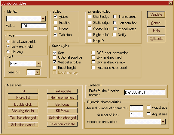
Note that if you are editing a .res file, and you haven't defined a project for weditres, only a portion of this dialog will be visible.
This text will be shown in the text field. You can enter any text here.
The #define under which this combo box will be used in your application. The numerical value is shown too, below.
Name and size of the font used for this combo box.
|
Button label |
Style |
Effect |
|
List always visible |
CBS_SIMPLE |
Displays the list box at all times. The current selection in the list box is displayed in the edit control. |
|
List+entry field |
CBS_DROPDOWN |
The user can select an item from the list or enter a new item in an antry field. |
|
List only |
CBS_DROPDOWNLIST |
The user can only select an item from the list. |
|
Visible |
WS_VISIBLE |
The control is visible at startup |
|
Inactive |
WS_DISABLED |
The control is disabled at startup |
|
Group |
WS_GROUP |
The control starts a new group of controls |
|
Tab stop |
WS_TABSTOP |
The control can be reached with the Tab key. |
|
Sort |
CBS_SORT |
Automatically sorts the strings in the list. |
|
Optional scroll bar |
CBS_DISABLENOSCROLL |
Shows a disabled vertical scroll bar in the list box when the box does not contain enough items to scroll. Without this style, the scroll bar is hidden when the list box does not contain enough items. |
|
Vertical scrollbar |
WS_VSCROLL |
List has a vertical scrollbar. |
|
Exact height |
CBS_NOINTEGRALHEIGHT |
Specifies that the size of the combo box is exactly the size specified by the application when it created the combo box. Normally, Windows sizes a combo box so that it does not display partial items. |
|
Local memory |
CBS_HASSTRINGS |
Specifies that an owner-drawn combo box contains items consisting of strings. The combo box maintains the memory and address for the strings, so the application can use the CB_GETLBTEXT message to retrieve the text for a particular item. |
|
DOS character conversion. |
CBS_OEMCONVERT |
Converts text entered in the combo box edit control. The text is converted from the Windows character set to the DOS character set and then back to the Windows set. This ensures proper character conversion when the application calls the CharToOem function to convert a Windows string in the combo box to DOS characters. This style is most useful for combo boxes that contain filenames and applies only to combo boxes created with the CBS_SIMPLE or CBS_DROPDOWN style. |
|
Owner draw fixed |
CBS_OWNERDRAWFIXED |
Specifies that the owner of the list box is responsible for drawing its contents and that the items in the list box are all the same height. The owner window receives a WM_MEASUREITEM message when the combo box is created and a WM_DRAWITEM message when a visual aspect of the combo box has changed. |
|
Owner draw variable |
CBS_OWNERDRAWVARIABLE |
Specifies that the owner of the list box is responsible for drawing its contents and that the items in the list box are variable in height. The owner window receives a WM_MEASUREITEM message for each item in the combo box when you create the combo box ; the owner window receives a WM_DRAWITEM message when a visual aspect of the combo box has changed. |
|
Automatic horz. scroll. |
CBS_AUTOHSCROLL |
Automatically scrolls the text in an edit control to the right when the user types a character at the end of the line. If this style is not set, only text that fits within the rectangular boundary is allowed |
|
Client edge |
WS_EX_CLIENTEDGE |
Specifies that a window has a 3D look-that is, a border with a sunken edge |
|
Static edge |
WS_EX_STATICEDGE |
Static edge around the text |
|
Accept files |
WS_EX_ACCEPTFILES |
Specifies that a window created with this style accepts drag-and-drop files. |
|
Right to left |
WS_EX_RIGHT |
Gives a window generic right-aligned properties. This depends on the window class. |
|
Help ID |
Not supported yet |
|
|
Transparent |
WS_EX_TRANSPARENT |
Not very useful for a combo box |
|
Left scrollbar |
Displays the vertical scrollbar at the left |
|
|
Modal frame |
WS_EX_DLGMODALFRAME |
Encloses the combo in a modal frame |
|
Notify |
|
Button |
Windows message |
Description |
|
Init |
WM_INITDLG |
You can get called at the initialization of the dialog box, to initialize things for this specific control. Normally this is not used. The callback has the form : DlgXXXComboYYYInit(HWND hwnd, WPARAM wParam,LPARAM lParam) ; |
|
Hiding list |
CBN_CLOSEUP |
This message is sent when the list box of a combo box has been closed.If you want to be notified when this message arrives, weditres will generate a callback of the form : DlgXXXComboYYYHideList(HWND hwnd,WPARAM wParam,LPARAM lParam) ; |
|
Double click |
CBN_DBLCLK |
This message is sent when the user double-clicks a string in the list box of a combo box. If you want to take a special action here, weditres will generate a callback of the form : DlgXXXComboYYYDoubleClick(HWND hwnd,WPARAM wParam,LPARAM lParam) ; |
|
Show list |
CBN_DROPDOWN |
This message is sent when the list box of a combo box is about to be made visible.If you want to take a special action, weditres will generate a callback of the form : DlgXXXComboYYYShowList(HWND hwnd,WPARAM wParam,LPARAM lParam) ; |
|
Text update |
CBN_EDITUPDATE |
This message is sent when the edit control portion of a combo box is about to display altered text. This notification message is sent after the control has formatted the text, but before it displays the text. The generated callback has the form : DlgXXXComboYYYTextUpdate(HWND hwnd,WPARAM wParam,LPARAM lParam) ; |
|
Text has changed |
CBN_EDITCHANGE |
This message is sent after the user has taken an action that may have altered the text in the edit control portion of a combo box. Unlike the CBN_EDITUPDATE notification message, this notification message is sent after Windows updates the screen. The callback has the form : DlgXXXComboYYYTextChange(HWND hwnd,WPARAM wParam,LPARAM lParam) ; |
|
Selection cancel |
CBN_SELENDCANCEL |
This message is sent when the user selects an item, but then selects another control or closes the dialog box. It indicates the user's initial selection is to be ignored. The callback has the form : DlgXXXComboYYYSelCancel(HWND hwnd,WPARAM wParam,LPARAM lParam) ; |
|
No more memory |
CBN_ERRSPACE |
This message is sent when a combo box cannot allocate enough memory to meet a specific request. The generated callback has the form : DlgXXXComboYYYErrSpace(HWND hwnd,WPARAM wParam,LPARAM lParam) ; |
|
Get focus |
CBN_SETFOCUS |
This message is sent when a combo box receives the keyboard focus. The generated callback has the form : DlgXXXComboYYYSetFocus(HWND hwnd,WPARAM wParam,LPARAM lParam) ; |
|
Kill focus |
CBN_KILLFOCUS |
This message is sent when a combo box looses the keyboard focus. The generated callback has the form : DlgXXXComboYYYKillFocus(HWND hwnd,WPARAM wParam,LPARAM lParam) ; |
|
Sel changed |
CBN_SELCHANGE |
This message is sent when the selection in the list box of a combo box is about to be changed as a result of the user either clicking in the list box or changing the selection by using the arrow keys. The callback generated has the form : DlgXXXComboYYYSelChange(HWND hwnd,WPARAM wParam,LPARAM lParam) ; |
|
Sel validate |
CBN_SELENDOK |
This message is sent when the user selects a list item, or selects an item and then closes the list. It indicates that the user's selection is to be processed. The callback has the form : DlgXXXComboYYYSelValidate(HWND hwnd,WPARAM wParam,LPARAM lParam) ; |
List box items can be represented by text strings, bitmaps, or both. If the list box is not large enough to display all the list box items at once, the list box can provide a scroll bar. The user maneuvers through the list box items, scrolling the list when necessary, and selects or removes the selection from items. Selecting a list box item changes its visual appearance, usually by changing the text and background colors to the colors specified by the operating system metrics for selected items. When the user selects an item or removes the selection from an item, Windows sends a notification message to the parent window of the list box.
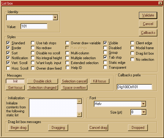
Note that if you are editing a .res file, and you haven't defined a project for weditres, only a portion of this dialog will be visible.
The #define under which this list box will be used in your application. This is the define you use when you access the control from your program. The numerical value is shown too, below.
Name and size of the font used for this list box.
|
Button |
Style |
Effect |
|
Standard |
LBS_STADARD |
Sorts strings in the list box alphabetically. The parent window receives an input message whenever the user clicks or double-clicks a string. The list box has borders on all sides. |
|
Border |
WS_BORDER |
Has a border around it. |
|
Sort |
LBS_SORT |
Sorts strings in the list box alphabetically. |
|
Notify |
LBS_NOTIFY |
Notifies the parent window with an input message whenever the user clicks or double-clicks a string in the list box. |
|
Vert. Scroll |
WS_VSCROLL |
Has a vertical scroll (default) |
|
Horz scroll |
WS_HSCROLL |
Has a horizontal scroll |
|
Use tab tops |
LBS_USETABSTOPS |
Enables a list box to recognize and expand tab characters when drawing its strings. The default tab positions are 32 dialog box units. A dialog box unit is a horizontal or vertical distance. One horizontal dialog box unit is equal to 0.25 of the current dialog box base-width unit. Windows calculates these units based on the height and width of the current system font. The GetDialogBaseUnits function returns the current dialog box base units in pixels. |
|
No redraw |
LBS_NOREDRAW |
Specifies that the list box's appearance is not updated when changes are made. You can change this style by sending a WM_SETREDRAW message at any time. |
|
Disable no scroll |
LBS_DISABLENOSCROLL |
Shows a disabled vertical scroll bar for the list box when the box does not contain enough items to scroll. If you do not specify this style, the scroll bar is hidden when the list box does not contain enough items. |
|
No integral height |
LBS_NOINTEGRALHEIGHT |
Specifies that the size of the list box is exactly the size specified by the application when it created the list box. Normally, Windows sizes a list box so that the list box does not display partial items. |
|
Want keyb. input |
LBS_WANTKEYBOARDINPUT |
Specifies that the owner of the list box receives WM_VKEYTOITEM messages whenever the user presses a key and the list box has the input focus. This enables an application to perform special processing on the keyboard input. |
|
Owner draw fixed |
LBS_OWNERDRAWFIXED |
Specifies that the owner of the list box is responsible for drawing its contents and that the items in the list box are the same height. The owner window receives a WM_MEASUREITEM message when the list box is created and a WM_DRAWITEM message when a visual aspect of the list box has changed. |
|
Owner draw variable |
LBS_OWNERDRAWVARIABLE |
Specifies that the owner of the list box is responsible for drawing its contents and that the items in the list box are variable in height. The owner window receives a WM_MEASUREITEM message for each item in the combo box when the combo box is created and a WM_DRAWITEM message when a visual aspect of the combo box has changed. |
|
Has strings |
LBS_HASSTRINGS |
Specifies that a list box contains items consisting of strings. The list box maintains the memory and addresses for the strings so that the application can use the LB_GETTEXT message to retrieve the text for a particular item. By default, all list boxes except owner-drawn list boxes have this style. You can create an owner-drawn list box either with or without this style. |
|
Multi column |
LBS_MULTICOLUMN |
Specifies a multicolumn list box that is scrolled horizontally. The LB_SETCOLUMNWIDTH message sets the width of the columns. |
|
Multiple selection |
LBS_MULTISEL |
Turns string selection on or off each time the user clicks or double-clicks a string in the list box. The user can select any number of strings. |
|
Extended selection |
LBS_EXTSEL |
Allows multiple items to be selected by using the SHIFT key and the mouse or special key combinations. |
|
Help ID |
Not supported in this version |
|
|
Visible |
WS_VISIBLE |
The list box is visible at startup |
|
Disabled |
WS_DISABLED |
The list box is disabled at startup. |
|
Group |
WS_GROUP |
The list box is the start of a new group of controls. |
|
Tab stops |
WS_TABSTOP |
The list box can be reached with the tab key. |
|
Static edge |
WS_EX_STATICEDGE |
Static edge around the control. |
|
Transparent |
WS_EX_TRANSPARENT |
Transparent list box... |
|
Client edge |
WS_EX_CLIENTEDGE |
Client edge around client area. |
|
Modal frame |
List box has a modal frame around it. Not recommended. |
|
|
Drag list box |
List box accepts dragging of items. |
|
|
No selection |
LBS_NOSEL |
The list box doesn't allow any selection. |
|
Button |
Message |
Description |
|
Init |
WM_INITDLG |
You can get called at the initialization of the dialog box, to initialize things for this specific control. Normally this is not used. The callback has the form : DlgXXXListYYYInit(HWND hwnd, WPARAM wParam,LPARAM lParam) ; |
|
Get focus |
LBN_SETFOCUS |
This message is sent when the list box receives the keyboard focus. The generated callback has the form : DlgXXXListYYYSetFocus(HWND hwnd,WPARAM wParam,LPARAM lParam) ; |
|
Double click |
LBN_DBLCLK |
This message is sent when the user has clicked in an item of the list box. The generated callback has the form : DlgXXXListYYYDoubleClick(HWND hwnd,WPARAM wParam,LPARAM lParam) ; |
|
Selection changed |
LBN_SELCHANGE |
This message is sent when the selection in the list box changes. The generated callback has the form : DlgXXXListYYYSelChange(HWND hwnd,WPARAM wParam,LPARAM lParam) ; |
|
Selection cancel |
LBN_SELCANCEL |
This message is sent when the user has cancelled the selection in the list box. The generated callback has the form : DlgXXXListYYYSetCancel(HWND hwnd,WPARAM wParam,LPARAM lParam) ; |
|
Space overflow |
LBN_ERRSPACE |
This message is sent when the list box runs out of memory. The generated callback has the form : DlgXXXListYYYErrSpace(HWND hwnd,WPARAM wParam,LPARAM lParam) ; |
|
Kill focus |
LBN_KILLFOCUS |
The message is sent when the list box looses the focus. The generated callback has the form : DlgXXXListYYYKillFocus(HWND hwnd,WPARAM wParam,LPARAM lParam) ; |
Drag list boxes use the following structure.
Typedef struct DRAGLISTINFO, *LPDRAGLISTINFO ;
uNotification Notification code that specifies the type of drag event. This member can be one of the following values :
Value Meaning
DL_BEGINDRAG The user has clicked the left mouse button on a list item.
DL_CANCELDRAG The user has canceled the drag operation by clicking the right mouse button or pressing the ESC key.
DL_DRAGGING The user has moved the mouse while dragging an item.
DL_DROPPED The user has released the left mouse button, completing a drag operation.
hWnd Handle to drag list box.
ptCursor POINT structure that contains the current x- and y-coordinates of the mouse cursor
Here is a description of the callbacks generated by weditres for a list box drag operation.
|
Button |
Message |
Description |
|
Begin drag |
DL_BEGINDRAG |
This message notifies the parent window of a drag list box that the user has clicked the left mouse button on a list item. The callback for this message is : long DlgXXXListYYYBeginDrag(HWND hwnd, DRAGLISTINFO * dlInfo) ; You should return either one (go on and start dragging) or zero (cancel the whole operation). |
|
Cancel Drag |
DL_CANCELDRAG |
This message arrives if the user has canceled the drag operation. The callback has the form : long DlgXXXListYYYCancelDrag(HWND hwnd,DRAGLISTINFO * dlInfo) ; The return value is ignored. |
|
Dragging |
DL_DRAGGING |
This message arrives continuosly as the user proceeds with the drag operation. The callback has the form : long DlgXXXListYYYDragging(HWND hwnd,DRAGLISTINFO *dlInfo) ; The return value determines the type of mouse cursor that the drag list should set ; it can be the DL_STOPCURSOR, DL_COPYCURSOR, or DL_MOVECURSOR value. If any other value is returned, the cursor does not change. |
|
End Drag |
DL_DROPPED |
This message arrives when the user ends the drag operation. The callback has the form : long DlgXXXListYYYEndDrag(HWND hwnd,DRAGLISTINFO *dlInfo) ; |
Normally you should set a callback to all the messages sent. It would be a bad programming practice to leave the problem of whether the user can start a drag operation for instance, to the default dialog box procedure that always returns zero. This would mean that the user could never start a drag operation...
A check box consists of a square box and application-defined text , an icon, or a bitmap that indicates a choice the user can make by selecting the button. Applications display check boxes in a group box to permit the user to choose from a set of related, but independent options.
Note that if you are editing a .res file, and you haven't defined a project for weditres, only a portion of this dialog will be visible.
You should specify the prefix to be used for this control, and the font to be used.
This text will be shown in the check box. You can enter any text here up to 255 chars.
The #define under which this check box will be used in your application. This is the define you use when you call the IsDlgButtonChecked function for instance. The numerical value is shown too, below.
Name and size of the font used for this check box.
If you check this check box, weditres will generate a call to the windows API CheckDlgButton, to check the check button when initializing the dialog box.
The 'Click' message is received when the check box has been activated. This message is not received when the check box is deactivated, only when the transition is to the 'on' state. The callback is of the form:
DlgBoxXXXCheckBoxCliked(HWND hwnd, WPARAM wParam, LPARAM lParam) ;
|
Button text |
Style |
Effect |
|
Automatic |
BS_AUTOCHECKBOX |
Creates a button that is the same as a check box, except that the check state automatically toggles between checked and unchecked each time the user selects the check box. |
|
Three state |
BS_AUTO3STATE |
Creates a button that is the same as a three-state check box, except that the box changes its state when the user selects it. The state cycles through checked, grayed, and unchecked. |
|
Left text |
BS_LEFT |
Places text on the left side of the check box |
|
Visible |
WS_VISIBLE |
The check box is visible at startup. |
|
Disabled |
WS_DISABLED |
The check box is disabled at startup. |
|
Multi line |
BS_MULTILINE |
The text of the check box can be wrapped into several lines of text. |
|
Client edge |
WS_EX_CLIENTEDGE |
Specifies that a window has a 3D look-that is, a border with a sunken edge |
|
Static edge |
WS_EX_STATICEDGE |
Creates a window with a three-dimensional border style intended to be used for items that do not accept user input. |
|
Push like |
The look of the check box is very similar to a push button. It remains sunken when selected. |
|
|
Tab stop |
WS_TABSTOP |
The Tab key can be used to move into the control |
|
Help ID |
The button can answer the WM_HELP message. Not supported in this version. |
|
|
Transparent |
WS_EX_TRANSPARENT |
The button is transparent. Not really a good idea for an item that should receive user input... |
|
Notify |
BS_NOTIFY |
Enables a button to send BN_DBLCLK, BN_KILLFOCUS, and BN_SETFOCUS notification messages to its parent window. Note that buttons send the BN_CLICKED notification message regardless of whether it has this style. Note that weditres doesn't handle this messages, so you should process them yourself within your default dialog box procedure. |
|
Group |
WS_GROUP |
The check box is a group separator. |
A group box is a rectangle that surrounds a set of controls, such as check boxes or radio buttons, with application-defined text (label) in its upper left corner. The sole purpose of a group box is to organize controls related by a common purpose (usually indicated by the label).
The styles of a group box are described in detail in the documentation of any of the other controls.
There are no callbacks, since the group box sends no messages, and receives no input.
You will notice that group boxes carry the elements that they contain in the editor, when you move them. Modifying the 'sticky group boxes' check box in the configuration of the editor can change this behavior.
This control, like the group box above, is just for grouping purposes. It receives no input and sends no messages.
This control,
like the group box above, is just for grouping purposes. It receives no input
and sends no messages.
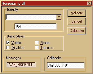
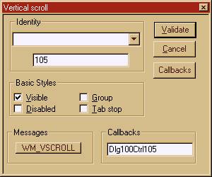
These controls are seldom used by themselves in dialog boxes. They can send only one message: WM_HSCROLL or WM_VSCROLL.
Since there is only one message, no suffix will be added to the name of the control procedure as specified in the 'Callbacks' edit field. The procedure would be then :
void DlgXXXScrollYYY(HWND hwnd,UINT message,WPARAM wParam,LPARAM lParam) ;
The message argumet can be either WM_VSCROLL or WM_HSCROLL. This way you can use a single callback procedure for both messages.
To the user, a spin control and its buddy window often look like a single control. You can specify that an up-down control automatically position itself next to its buddy window and that it automatically set the caption of the buddy window to its current position. For example, you can use a spin control with an edit control to prompt the user for numeric input.
Spin controls are called up and down controls in the documentation from Microsoft. Thy existed before under windows 31 under the name of spin controls, and I didn't feel like changing their name just because Microsoft decided a new name. Many of us implemented those under windows 3.1. This explains the UDS prefix for the spin control styles: Up Down Style.
Here is an example configuration:

The spin control is at the left of the entry field. Pressing the arrows you can increment/decrement the edit field contents.
The Identity and Value fields have the same meaning than in the other controls.
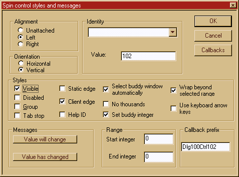
|
Input field |
Window style |
Purpose |
|
Visible |
WS_VISIBLE |
Makes the control visible at startup |
|
Disabled |
WS_DISABLED |
Disables the control at startup |
|
Group |
WS_GROUP |
Marks the start of a group of controls |
|
Tab stop |
WS_TABSTOP |
Makes this control reachable with the TAB key. |
|
Static edge |
WS_EX_STATICEDGE |
Has a static edge around it |
|
Client edge |
WS_EX_CLIENTEDGE |
Has an edge around the client area |
|
Help ID |
Not implemented in this version |
|
|
Select buddy window automatically |
UDS_AUTOBUDDY |
Automatically selects the previous window in the Z order as the spin control's buddy window. Please be sure that the window selected is a good one. For instance, if the Z order indicates a Group box, the spin control will attach itself to a group box, not a very useful thing... Use the <Group> menu option of weditres to select the right control. |
|
No thousands |
UDS_NOTHOUSANDS |
Does not insert a thousands separator between every three decimal digits. |
|
Set buddy integer |
UDS_SETBUDDYINT |
Causes the spin control to set the text of the buddy window (using the WM_SETTEXT message) when the position changes. The text consists of the position formatted as a decimal or hexadecimal string. |
|
Wrap beyond selected rage |
UDS_WRAP |
Causes the position to « wrap » if it is incremented or decremented beyond the ending or beginning of the range. |
|
Use keyboard arrow keys |
UDS_ARROWKEYS |
Causes the up-down control to increment and decrement the position when the UP ARROW and DOWN ARROW keys are pressed. |
|
Unattached |
UDS_ALIGNNONE |
No alignment to the buddy window |
|
Left aligned |
UDS_ALIGNLEFT |
Positions the spin control next to the left edge of the buddy window. The buddy window is moved to the right and its width decreased to accommodate the width of the spin control. |
|
Right aligned |
UDS_ALIGNRIGHT |
Positions the spin control next to the right edge of the buddy window. The width of the buddy window is decreased to accommodate the width of the spin control. |
|
Input field |
Window message |
Purpose |
|
Value will change |
UDN_DELTAPOS |
The operating system sends the UDN_DELTAPOS notification message to the parent window of an spin control when the position of the control is about to change. This happens when the user requests a change in the value by pressing the control's up or down arrow. The UDN_DELTAPOS message is sent before the WM_VSCROLL or WM_HSCROLL message that actually changes the control's position. This lets you examine, allow, modify, or disallow the change. return TRUE in your callback in response to this message to prevent the change in the control's position. Return FALSE to allow the change The callback will be of the form : int DlgXSpinYDeltaPos(HWND hwnd,PNMHDR pnmhdr) ; |
|
Value has changed |
WM_HSCROLL or WM_VSCROLL |
This notifies you of the new value. The generated callback has the form : int DlgXXSpinYY(HWND hwnd,UINT msg,WPARAM wParam,LPARAM lParam) ; Since the message received is passed to the callback, you can diffrentiate between horizontal and vertical spin controls. |
|
Range |
UDM_SETRANGE |
Sets the upper and lower range for the spin control. |
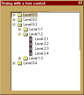
Here we have a dialog with a big tree control in it. This is a very complex control, that can do a lot of things but needs a lot of effort to get it right. Weditres can help you a bit by generating some of the code that needs to be written.
The properties box of the tree control matches this element's complexity. Here it is:

Besides the normal window styles like visible, client edge, etc etc, a tree control can have the following styles of its own :
|
Description |
Style |
Purpose |
|
Has lines to join items |
TVS_HASLINES |
Enhances the representation of the hierarchy by drawing lines that link child items to their parent item. This style does not link items at the root of the hierarchy. |
|
Has lines at root position |
TVS_LINESATROOT |
When combined with the TVS_HASLINES style, this forces the tree control to draw lines at the root of the hierarchy. |
|
Buttons to indicate item state |
TVS_HASBUTTONS |
The user can expand or collapse a parent item's list of child items by double_clicking the parent item. A tree view control that has this style adds a button to the left of each parent item. The user can click the bitton once instead of double clicking the parent item to expand or collapse the child. Again, this styme does not add buttons at the root. You should specify the style TVS_LINESATROOT to get buttons at the root of the hierarchy. |
|
Edit labels |
TVS_EDITLABELS |
This style makes it possible for the user to edit the labels of tree view items. |
|
Show always the selected item |
TVS_SHOWSELALWAYS |
This style forces a selected item to remain selected when the control loses focus. |
|
Disable drag and drop |
TVS_DISABLEDRAGANDROP |
This style disables the drag and drop feature. |
|
Description |
Message |
Purpose |
|
Begin drag |
TVN_BEGINDRAG |
Notifies the program that the user has begun a drag operation with the left mouse. The callback function will be of the form : xxxBeginDrag(HWND,NM_TREEVIEW *) ; |
|
Begin right button drag |
TVN_BEINRDRAG |
The user has begun a drag operation with the right mouse button. The callback will be of the form : xxxBeginRDrag(HWND,NM_TREEVIEW *) ; |
|
Begin label editing |
TVN_BEGINLABELEDIT |
The user has begun to edit a tree label. The callback will be of the form : xxxBeginLabelEdit(HWND,TV_DISPINFO *) ; |
|
End label editing |
TVN_ENDLABELEDIT |
The user has ended the editing of a label in an item. The callback will be of the form : xxxEndLabelEdit(HWND,TV_DISPINFO *) ; |
|
Needs display information |
TVN_GETDISPINFO |
Requests information that the tree view control requires to display an item. The callback has the form : xxxGetDispInfo(HWND,TV_DISPINFO *) ; |
|
Set display information |
TVN_SETDISPINFO |
Informs the parent window that it should set the display information it has about an item. The callback has the form : xxxSetDispInfo(HWND,TV_DISPINFO *) ; |
|
Selection has changed |
TVN_SELCHANGED |
Informs the parent window that the selection has changed from one item to another. The callback has the form : xxxSelChanged(HWND,NM_TREEVIEW *) ; |
|
Selection is changing |
TVN_SELCHANGING |
Informs the parent window that the selection is about to change. The callback as the form : xxxSelChanging(HWND,NM_TREEVIEW *) ; |
|
Item is expanding |
TVN_ITEMEXPANDING |
Informs the parent window that an item is going to expand or collapse. The callback has the form : xxxItemExpanding(HWND,NM_TREEVIEW *) ; |
|
Item has been expanded |
TVN_ITEMEXPANDED |
Informs the parent window that an item has been expanded. The callback has the form : xxxItemExpanded(HWND,NM_TREEVIEW *) ; |
|
Key has been pressed |
TVN_KEYDOWN |
A keyboard event. The callback has the form : xxxKeyDown(HWND,TV_KEYDOWN *) ; |
|
Return |
WM_NOTIFY |
The return key has been pressed. The callback has the form : xxxReturnPressed(HWND,NMHDR *) ; |
The parameter 'hwnd' in all messages above is the handle of the dialog window. You can get the handle of the tree control by using the GetDlgItem primitive.
The structures used are the following:
Contains information about a tree view notification message.
typedef struct _NM_TREEVIEW NM_TREEVIEW ;
typedef NM_TREEVIEW *LPNM_TREEVIEW ;
Specifies an NMHDR structure. The code member of the NMHDR structure can one of the following notification codes that identify the message being sent : TVN_BEGINDRAG, TVN_BEGINRDRAG, TVN_DELETEITEM, TVN_ITEMEXPANDED, TVN_ITEMEXPANDING, TVN_SELCHANGED, TVN_SELCHANGING.
Specifies a notification-specific action flag.
Specifies a TV_ITEM structure that contains information about the old item state. This member is zero for notification messages that do not use it.
Specifies a TV_ITEM structure that contains information about the new item state. This member is zero for notification messages that do not use it.
Specifies a POINT structure that contains the client coordinates of the mouse at the time the event occurred that caused the notification message to be sent.
The TV_ITEM structure specifies or receives attributes of a tree-view item.
typedef struct _NM_TREEVIEW NM_TREEVIEW ;
Specifies an NMHDR structure. The code member of the NMHDR structure can one of the following notification codes that identify the message being sent : TVN_BEGINDRAG, TVN_BEGINRDRAG, TVN_DELETEITEM, TVN_ITEMEXPANDED, TVN_ITEMEXPANDING, TVN_SELCHANGED, TVN_SELCHANGING.
Specifies a notification-specific action flag.
Specifies a TV_ITEM structure that contains information about the old item state. This member is zero for notification messages that do not use it.
itemNew
Specifies a TV_ITEM structure that contains information about the new item state. This member is zero for notification messages that do not use it.
ptDrag
Specifies a POINT structure that contains the client coordinates of the mouse at the time the event occurred that caused the notification message to be sent.
typedef struct tagNMHDR NMHDR ;
hwndFrom
Handle to control sending message. In the above examples is the handle of the tree control.
idFrom
Identifier of control sending message. In the case above, this would be the id of the tree control.
code
Specifies the notification code.
typedef struct _TV_DISPINFO TV_DISPINFO ;
Here is an example of a callback function that handles the begin drag message, adapted from the documentation of MSDN.
// MyTreeViewBeginDrag - begins dragging an item in a tree view control.
// hwndTV - handle to the image list.
// lpnmtv - address of information about the item being dragged.
void MyTreeViewBeginDrag(HWND hwndTV, LPNMTREEVIEW lpnmtv)
You have surely remarked that we have captured the mouse in that function above. To follow the item in its long journey we just follow the WM_MOUSEMOVE messages. To handle those messages you should check the 'All' check box in the properties dialog of the dialog box that contains the tree control, and handle the mouse move message like this :
// Dlg_MouseMove - drags an item in a tree view control,
// highlighting the item that is the target.
// hwndParent - handle to the parent window.
// hwndTV - handle to the tree view control.
// xCur and yCur - x- and y-coordinates of the mouse cursor.
void Dlg_MouseMove(HWND hwndParent, HWND hwndTV, LONG xCur, LONG yCur)
}
return ;
When the control arrives finally at the destination we do :
// Main_OnLButtonUp - stops dragging a tree view item, releases the
// mouse capture, and shows the mouse cursor. This is called when the
// dialog procedure receives the WM_LBUTTONUP message
// Global variable
g_fDragging - indicates whether a drag operation is underway.
void DlgOnLButtonUp(void)
return ;
This control allows you to input analog values in an easy to understand fashion. Here is a screen shot of different sliders with different attributes.
|
|
Sliders can be drawn in vertical or horizontal position, with rounded or not pointers, with ticks above or below, etc.
To control the different options you use the following properties dialog box :

The slider interfaces with the dialog box that contains it only with the WM_HSCROLL or the WM_VSCROLL message. Weditres will add code to handle those messages and call your callback procedure when the slider wants to say to you something.
You can add a range of values, and Weditres will generate code to set that range of values at run time during the initialization of the dialog box.
The other styles shown are the usual ones already explained in all the other controls (visible, tab stop, etc). They will not be repeated here.
This control allows the user to choose a date. Here is an example.
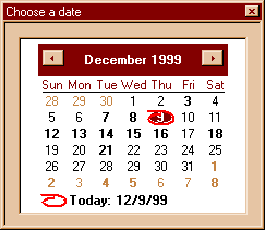
The styles that you can choose for this control are displayed in the following dialog box:
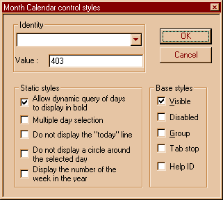
|
Description |
Style |
Purpose |
|
Allow dynamic query of days to display in bold |
MCS_DAYSTATE |
The month calendar will send MCN_GETDAYSTATE notifications to request information about which days should be displayed in bold. For more information about supporting this style, see Processing the MCN_GETDAYSTATE Notification Message |
|
Multiple day selection |
MCS_MULTISELECT |
The month calendar will allow the user to select a range of dates within the control. By default, the maximum range is one week. You can change the maximum range that can be selected by using the MCM_SETMAXSELCOUNT message. |
|
Do not display the "today" line |
MCS_NOTODAY |
The month calendar control will not display the "today" date at the bottom of the control. |
|
Do not display a circle around the selected day |
MCS_NOTODAYCIRCLE |
The month calendar control will not circle the "today" date. |
|
Display the number of the week in the year |
MCS_WEEKNUMBERS |
The month calendar control will display week numbers (1-52) to the left of each row of days. Week 1 is defined as the first week that contains at least four days. |
Month calendar controls send the MCN_GETDAYSTATE notification message to request information about how the days within the visible months should be displayed. The following application-defined function, DoNotify, processes MCN_GETDAYSTATE by filling an array of MONTHDAYSTATE values to highlight the 15th day of each month.
DoNotify extracts the number of MONTHDAYSTATE values needed from the cDayState member of the NMDAYSTATE structure that lParam points to. It then loops to set the 15th bit in each element of the array, using the application-defined BOLDDAY macro.
BOOL WINAPI DoNotify(HWND hwnd, UINT msg, WPARAM wParam, LPARAM lParam)
lpnmDS->prgDayState = mds;
break;
}
return FALSE;
}
Both the MCM_SETDAYSTATE message and MCN_GETDAYSTATE notification message require an array of MONTHDAYSTATE values to determine how dates will be displayed. Each month that the control displays must have a corresponding element within the array.
To support these messages, your application must properly prepare the array. The following is a simple macro that sets a bit in a MONTHDAYSTATE value for a given day within that month.
#define BOLDDAY(ds,iDay) if(iDay>0 && iDay<32)\
(ds)|=(0x00000001<<(iDay-1))
Using this macro, an application could simply loop through an array of important dates, setting bits within the corresponding array elements. This approach is not the most efficient, of course, but works well for many purposes. As long as your application sets MONTHDAYSTATE bits appropriately, it does not matter how those bits were set.
The framework will not generate code for this message. You should setup a procedure that catches all messages for your window, and within that procedure, treat the answer to this message as indicated above. To setup such a procedure open the properties of the dialog box as a whole, and then check the "ALL" button in the messages you want to handle. This way, you will become all messages. Within that procedure you should handle the WM_NOTIFY message, where this notifications arrive.
The menu editor shows you the menu in the form of a tree. Each top level pop-up corresponds to the top level items of the menu being edited.
To add a menu item just type insert (the 'ins' key), selecting before the menu item above the one you will introduce.
You do the same for introducing a new menu item in a pop-up.
You can test your menu to see it in 'action' by choosing 'test' in the 'File' option of the main menu of the menu editor.
Besides the tree with the items, you will se the following dialog box floating around. Here you enter the name of the menu, its associated symbol (#define), and its value.
In the 'Options' group you can change the appearance of the menu item, either for a normal menu item, or for a popup menu. Do not forget to press 'Apply' when you are done with changes.
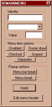
This utility allows you to edit the string tables contained in your resource file. String tables are a resource kind for storing character strings in the resource section of the executable instead of using string literal in the program text itself.
The original motivation for this was the ever-growing need under windows 3.0 to have more memory with the space severely limited to 64K for the stack, all character strings, and all static data. This lead to trying to make more space in the data segment by putting the strings somewhere else, and loading /unloadin[jn2]g them as needed.
But there are many other beneficial side effects, so the usage of string tables has stayed with us even in windows 98. One of the good side effects is the separation from message text from the code itself, so that if you need to translate the program into another language you do not need to edit the source files, but just the resource file, what is far easier for the person who is doing the translation, since he/she doesn't have to be a programmer AND a foreign language expert, a rare combination.
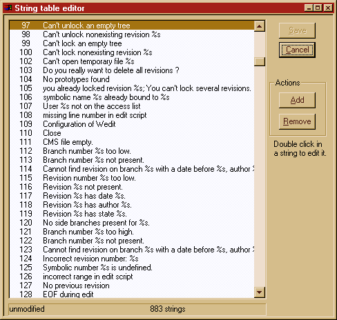
The string editor presents a simple interface. You double click in a string to edit one, or you can add/delete strings, as you may esteem necessary.
The 'Save' button doesn't save the modified resources to the disk immediately, but just writes it to the resource file in memory. It will get written to disk when you exit weditres.
An accelerator table is an association from keyboard keys combinations with a command item. This can be a menu command item, but this is not necessarily the case. When the user presses the defined keyboard keys combination (Ctrl+Shift+N, for example), the window procedure associated with the accelerator table will receive a WM_COMMAND message, containing the numerical value that you associated with this keyboard combination.
Fo instance, when you want that Ctrl+Shift+N do something special in your application, you define an accelerator key like
1) In your header file:
#define MENU_STOPCALCULATING 3000
2) In your resource file:
"^N" MENU_STOPCALCULATING SHIFT CONTROL
3) In your window procedure:
switch(message)
break;
}
You can have a menu item somewhere, with an item 'Stop calculations" but this is not mandatory. You receive from windows this message when you do not forget to add the TranslateMessage step in that famous MainLoop of your window procedure.
You can edit this table graphically from Weditres. To call the corresponding editor you should either use the menu item in the 'Objects' bar, or use the directory tree. There, (if there is already a resource table defined in the application), you will find your table. Just double click in its name and the accelerator editor will be called automatically.
The editor for this resource type is very simple. It will show you at startup a list of all defined items. You can perform the usual actions (Add, Modify, and Delete), with three buttons at the lower right.
If there is no accelerator table defined, the editor will automatically start the 'Add' action, supposing you are not very interested in contemplating an empty list. The Add/Change dialog box edits a single line of the accelerator table.
Instead of showing here yet another screen shot, I think it is better to spend more time explaining the concepts behind this.
Each entry in the table consists of:
A numerical value. This is the result of pressing the combination of keys.
An associated numerical identifier.
A set of flags that determine how the numerical value is interpreted.
You can define either plain Ascii keys combinations, or you can set the 'Virtual Key' flag, that indicates to Windows that the value is to be interpreted as a value for a virtual key, i.e. a key like VK_F1, VK_BACK, etc. All those values are defined in <windows.h>, and they give the programmer a view of the keyboard that is independent from the type of keyboard that is used.
It is important to be clear that the ASCII/VIRTUAL KEY flags are alternatives (hence the radio buttons in the editor). You can only use one of those.
You can add flags specifying:
CONTROL: That flag means that the CONTROL key has to be pressed for the keys combination to be valid.
SHIFT: Ditto but with the key Shift.
ALT: The same for the Alt key.
NOINVERT: This means that the menu item associated with the same identifier should not be highlighted if it exists at all.
These flags are not alternatives, they can all be set for the same key combination. They can be set/unset using the checkboxes in the dialog box that edits each line of the table.
The accelerator resource is named following the same conventions as the naming of all other resource types: either with a character string or an identifier. You load the resource using the LoadAccelerators window function that searches for the specified accelerator table.
The different steps involved in the construction of a dialog box.
To use a dialog box you have to
Structure of the generated code.
some code here to treat this message
. some code here to treat this message
A simple .rc file for our example
Controlling which files get generated.
Fixing a control in the screen
NM_TREEVIEW
TV_ITEM
NMHDR
TV_DISPINFO :
OK, that is the start. What about later ?
Processing the MCN_GETDAYSTATE Notification Message
Preparing the MONTHDAYSTATE Array
|
