Third-Party Design Guidelines
Table of Contents
Application Extensibility
Overview of Environments, Documents, and Types
Methods of Extending Autodesk Inventor
Command Blocking
UI for Embedded Environment Creation, Activation, and Deactivation
Environment User Interface Definition
Autodesk Inventor Design Considerations
Command Guidelines
General Guidelines
No Tabs
With Tabs
Control Alignment
Dialog box shape and layout
Globalization
Command User Interaction
Standard Commands
Transparent Commands (Modal vs. Modeless)
Guidelines for Command Type
Command Pulse
Messaging (User feedback)
Customers and third parties need to be able to extend Autodesk Inventor® software to address custom workflows and new markets. There are many types of applications with various levels of sophistication and differing purposes. Most applications fall into one of three categories:
Workflow Augmentation
In the simplest case, all the application may do is to add commands to augment existing workflows. A good example of this would be to add surface quality analysis, specialized measurement tools, or enhanced selection mechanisms.
Workflows Enabling New Functionality
A more sophisticated application might enable new workflows for analyzing, manipulating or creating existing data types used to model specific physical structures and their interrelationships. In such cases, a contextual environment might be required to group commands, provide specialized graphics and browser representations, and specific method of interaction using the select tool. Take the following example:
New environment to analyze assembly constraint failures or provide tolerance analysis functionality.
A replacement printing facility that provides enhanced print preview and composition functionality.
A 3D Studio MAX®/3ds maxT add-in for Autodesk Inventor that would be available from both Part and Assembly environments. The 3D Studio MAX application data would be stored in separate data storage as well as via object attributes.
New Problem Solution using Environment and Hybrid Data Structures
The most sophisticated type of application is one that creates hybrid data structures composed of Autodesk Inventor data and custom data with complex interrelationships. For the application to function correctly, the referential integrity of the data must be maintained. Take the following scenarios as an example:
Company ABC creates an application to replace Autodesk Inventor Presentation environment using Autodesk Inventor Assembly document type as a foundation. It allows a user to place an assembly instance into its Presentation document. The ABC Explode command will evaluate the assembly instance in terms of hierarchical structure and assembly constraints. Based on the analysis, ABC creates its own unique constraint types which will position occurrences when evaluated by its proprietary ABC solver. Lastly, commands are provided to allow users to "tweak" the position of occurrences. The constraints and tweaks are stored in the ABC data segment. When the placed assembly changes, the user can invoke the ABC Update command to update the presentation. When this happens, the ABC constraints are validated and the solver updates occurrence positions and then reapplies the user-placed tweaks.
For the application to function correctly, ABC needs to ensure that changes are not made to the document of which it is not aware. For example, if company XYZ came along and allowed assembly features to operate on occurrences of the ABC Presentation document, the ABC explosion solver might not expect the local BRreps standing in for the occurrences. It is worse yet if a third-party allowed assembly constraint commands to operate on the data. In such a situation, unpredictable behavior may be experienced after each update of the ABC solver, as the "Autodesk Inventor" solver then kicks in to maintain its constraints. Unfortunately, the ABC Presentation add-in did not expect any assembly constraints to be present, just its specialized constraints evaluated by its solver.
Company 123 wants to add a tolerance analysis tool to be used in standard Autodesk Inventor assembly documents. It expects the user to create multiple independent analyses. It needs its own environment to present its commands, embellish the presentation of occurrence geometry, and graphically present and allow selection of its data. To establish the analysis conditions, it wants to use standard Autodesk Inventor work features and reference dimensions coupled with its own data types. The work features will be used to establish datum. The analysis will shift occurrences around and evaluate critical dimensions of interest to the user. The results will be presented in a statistical report.
For the application to function correctly, Company 123 needs to ensure that work features and dimensions it created as part of the analysis definition are not deleted or modified without its knowledge.
A custom furniture design system based on Autodesk Inventor. The application will not use any of the standard Autodesk Inventor modeling and assembly environments.
A Piping application based on the Autodesk Inventor part document. The piping application will be self contained and provide a custom-modeling environment using its own constraint solver.
Both of the above two situations are provided for by allowing third parties to create a data environment where they can control and monitor changes to "their" data structures. Their data structures may be a combination of Autodesk Inventor data types coupled with proprietary data types, the later stored in their own data segment. Autodesk Inventor allows the creation of proprietary data environment in three ways:
Create a new document type derived from a base Autodesk Inventor type (Part, Assembly, Drawing Manager)
Create a derived type of an embedded Autodesk Inventor document type (2D Sketch, 3D Sketch)
Create their own embedded document type (it may be transient)
|
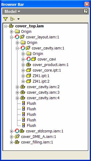
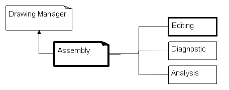
A document of a given type, when activated, presents itself through an Environment. An Environment is a unique user-interface-context specifically designed to act on the document's data to support specific workflows. In the figure, the document of type Assembly can be acted upon using three different environments. The default environment is Editing. A third-party company sells an add-in that provides Diagnostic and Analysis environments. |
|
An Environment defines the following:
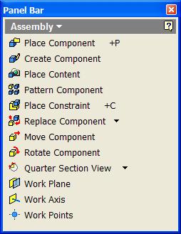
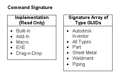
Autodesk Inventor will be extended by third-party companies and customers using stand-alone executables, add-in DLLs, and VBA Macros. The following figure illustrates the primary objects involved in the customization of the Autodesk Inventor application.
When a Third-Party application is based on a subtype of an Autodesk Inventor document, all of the commands are inherited from the parent document type. The Third Party must decide what commands should be blocked from the user in its environment.
|
Command authorization is a three-step process. On Type activation, Autodesk Inventor authorizes all built-in read-only commands and all File commands. Secondly, the document's Type handler can authorize additional commands. Lastly, an Environment handler can enable/disable commands. |
|
Upon command addition, an event is fired that provides an opportunity for the Type handler to authorize the command, and for the Environment handler to enable or disable the command.
The Type Handler should also have the opportunity to respond to the completion of a transaction with the ability to abort it.
When an Add-In defines a new Autodesk Inventor environment, the environment must be instantiated to be used. If an add-in wanted any open document to always have its environment instantiated, it could create the environment using the OnNewDocument and OnActivateDocument events.
|
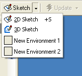
It will be more common for the add-in to allow the user to instantiate one or more instances of its environment. To do this the add-in would implement a command that is added to an existing environment. To increase ease-of-use, Autodesk Inventor provides a common user interface for creating environments as exampled by the 2D and 3D Sketch environments. When the add-in defines an environment that the user can instantiate, it is automatically added to the "environment" dropdown. |
|
|
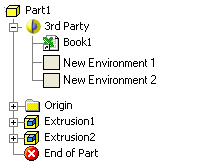
Once an environment is instantiated, it displays in the Third-Party collection within the Browser. The user can activate the environment by either:
|
|
|
As with all in-place activated environments, the Return command exits the active environment and activates the parent environment. |
|

 The Environment defines the contents of each
container listed below. The containers
are fixed in location, but the contents may change based on the
environment. The reason for this is
consistency in presentation in a Multiple Document Interface (MDI). When users switch (Ctrl +Tab) between their
open windows in the Autodesk Inventor application there should be no jumping
around because the containers have a set size and location.
The Environment defines the contents of each
container listed below. The containers
are fixed in location, but the contents may change based on the
environment. The reason for this is
consistency in presentation in a Multiple Document Interface (MDI). When users switch (Ctrl +Tab) between their
open windows in the Autodesk Inventor application there should be no jumping
around because the containers have a set size and location.

The three containers above each contain one Command Bar.
The Third Party application
may use the Autodesk Inventor Browser or replace it with its own Active X
control.
Browser
Graphics Screen (Object and Environment)
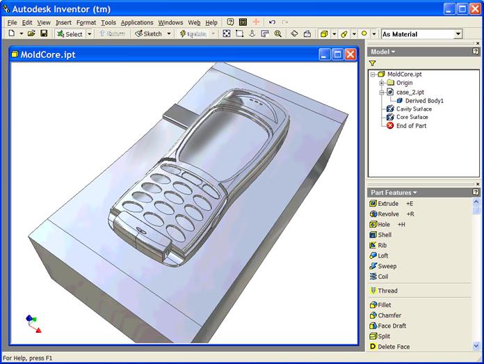
The application subtype document inherits its Command Bars from its parent document type. The application also registers its own commands and command bars in Autodesk Inventor when the application is loaded. The application chooses what should be displayed in each container in the environment. Within the applications environment, the application can also decide which inherited commands and command groups it would like to block (made unavailable to the user).
Ease of Use - Ease by which the user understands functionality and completes the task (Willing to sacrifice a certain level of functionality in order to make the product easier to use)
Usage / Use Cases - Design for 95% case (Understanding the user's workflow and most frequent use of functionality)
Simplicity - Very closely tied to Ease of Use. Reduce the complexity of functionality whenever possible (Logically group functionality and avoid overloading user interfaces with too much functionality)
Discoverability - The user's ability to find a piece of functionality and use it. This ties in closely with Usage and understanding the user's workflow patterns. Make the functionality accessible in the appropriate and most logical context.
Aesthetics - Visually appealing (Style Guidelines)
Consistency - Reuse and reinforce workflows/user interaction models and the user interface
This section defines a framework for the definition of commands. The first purpose of the framework is to maximize commonality, consistency, and ease of localization of commands. Secondly, the framework was designed to be compliant with the Interface Design Principles.
The Autodesk Inventor software program has two basic classes of commands, Standard and Dialog. Standard commands are commands that do not use a dialog. Many standard commands are single action such as Zoom All or Delete. Other commands such as Line are multi-action in that they automatically loop to create multiple objects. Dialog-based commands present the user with options and process guidance via a dialog that persists during the life of the command.
Command Names
In most cases, a command name will have a maximum of two words, a verb and noun in that order and preferably one word, a verb. A command name displays in ToolTips and at the top of the dialog box, if one is used.
If applets share similar functionality, two rules should be followed:
Use the same command name; the applet will provide the context.
Coordinate with other applets or follow the examples of existing applets to ensure the UI for similar functionality is also similar, if not exactly the same.
Prompts
Prompts should be provided during command interaction to give the user additional information about his expected behavior.
Adhere to active color scheme at all times, including preview graphics and highlighting. The settings for the Active Color Scheme are all stored in the registry. When defining selection colors, the registry variables of the active color scheme should be used.
The registry keys for the Autodesk Inventor Color Schemes can be found in:
HKEY_CURRENT_USER\Software\Autodesk\Autodesk Inventor\RegistryVersionX.X\System\Preferences\ColorSchemes\Schemes
The icon design and color palette is based on the command's functionality and user interaction.
Yellow - Is used in the representation of existing geometry (part, feature, etc.)
Blue - Is used to represent the new geometry that is created as a result of the command
Red - Is used to indicate action (selection, movement, etc.)
Black - May be used to emphasize edges or wireframe geometry
Modifications of these base colors are done to create highlights and shading to provide a more 3D appearance.
The complete palette for icon design is below:

There are two standard bitmap sizes for Autodesk Inventor icons:
15 pixels high x 16 pixels wide for the small icons
22 pixels high x 24 pixels wide for the large icons
A detailed definition of appropriate fonts and sizes can be found in the Microsoft® Windows® User Interface Guidelines. The following Autodesk Inventor guidelines to be used for dialog layout are consistent with Microsoft Guidelines required for Office 97 compatibility.
In general, you should use Property Pages to implement tabbed dialogs. It allows for cleaner dialog layout when in the resource editor and for easier localization.
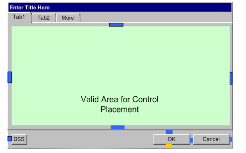
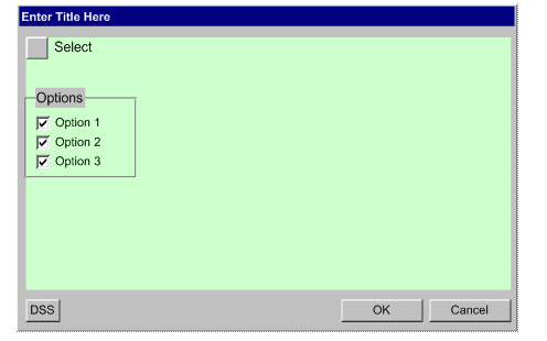
Figure 1, Standard Dialog Layout
In brief, the command design was guided by the following requirements:
Minimize the size of the dialog so as not to restrict access to the graphics window or browser.
Hide functionality that is used less than 10% of the time (More tab).
Make the interaction between the dialog and selection within the graphics window and browser discoverable and retainable.
Give the Documentation Team hooks for providing assistance
contextual to the task 
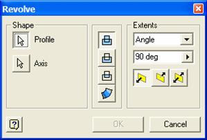
The following dialog gives an example of a dialog-based command built against the guidelines described in this section.

Figure 2, Example Dialog-Based Command
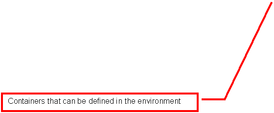
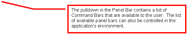
Avoid making a dialog box higher than it is wide. The eye is most relaxed when viewing a dialog box with the same 4/3 aspect ratio as the computer screen:

The dialog size must be as small is possible.
Everything must be legible.
Controls must be aligned in a clean, logical display. All similar controls must be aligned in an orderly arrangement.
Controls must be grouped and displayed logically and clearly.
The work flow must begin in the upper left area and move toward the bottom right area of the dialog.
Order the tab sequence to follow anticipated workflow in the dialog in general, which means top left to bottom right (allow access to controls through tab).
Generally, tab moves to the next control.
If a control is being edited, tab accepts the value entered and moves to the next control.
There should be fewer than nine tabs available in a dialog.
The group boxes must be used to group functionality where appropriate.
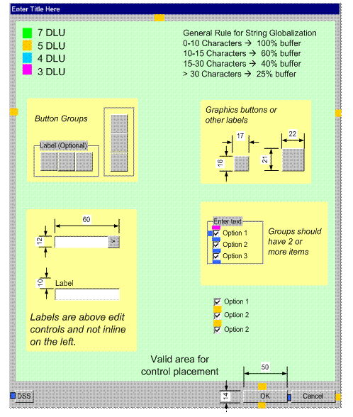
Allow room for captions, labels, and messages to grow (e.g., German can require as much as 100% more space for translation text). Make design decisions that allow for this growth. Location caption above a text field rather than to the left, for example, gives translators the entire length of that text field for translation. (Provisional value should be 30%.)
Good use of white space helps users find what they're looking for quickly. Dialogs should never look crowded or too complex. For example, you should avoid using more than six radio buttons. (If there are more, you may have to consider redesign or build sub- boxes)
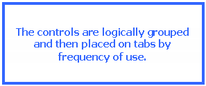
Command dialogs will be laid out in accordance with one of two standard layouts. The first layout illustrates a standard command dialog in which no controls are rarely used. The second layout makes use of tabs to segregate groups of information (logically grouped, then tab order by usage)
Single-Page
|
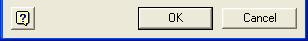
The Help, OK, and Cancel button are aligned along the bottom of the dialog. The Help button is left-aligned, and the OK and Cancel buttons are right-aligned as a group. All of the command options are available in the single window. |
|
Multi-Page
|
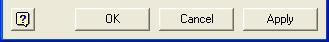
Autodesk Inventor command may use tabs (property page dialog) and may include a More tab to hide less frequently used items. The Help, OK, Cancel, and Apply buttons are aligned along the bottom of the dialog. The Help button is left-aligned, and the OK, Cancel, and Apply (optional Reset) buttons are right-aligned as a group. All command dialogs that implement dialog expansion using a More pushbutton should be using a More tab instead. The tab control has a standard 7 DLU margin from the dialog's left and right borders. The top and bottom margins are 4 DLUs. |
|
Note: As a general command dialog design rule, we should not keep a control active if it is not visible to the user. If the control is kept active, the user has very little context to understand its current state/mode -this should definitely be a consideration in tabbed dialogs.
Where space permits, descriptive images can be placed on the dialog. There is no predefined size limit. However, graphic labels must conform to either 17x16 or 22x21 dialog units.
In general, pictures (bmp) are highly preferred over icons. The tools to edit icons tools are severely limited. Additionally, their color depth is limited to 8-bit on some of the Autodesk Inventor-supported operating systems.
It is understood that development prefers icons because the mask behavior is completely built-in and all that is required is the LoadIcon function. However, the LoadImage function handles Icons, Cursor, and Bitmaps and provides an option to use the first pixel as a mask color.
The mask color for all images should be magenta (255,0,255) or in hex 00FF00FF.
Microsoft uses both text and graphic labels in the definition of command buttons and option groups in their dialog design. When graphic labels are used, ToolTips are always employed to assist with function identification. The following figure shows some examples from Office XP applications.
The question arises, when to use graphics and when to use text? Clearly, Microsoft uses text much more often than it uses graphics. In its newer applications, which are more HTML flavored, it tends to use graphics, text, and use of ToolTips.
Microsoft tends to use graphics when three factors act in concert: (1) there is a real-estate problem; (2) the actions are repeatedly used; (3) the graphic representation is sufficient so that the user will retain the association between image and action after having discovered it with ToolTips.
Many, not all, of the options in the Autodesk Inventor Dialog-based Object Commands share these three factors. Obviously, there is a shortage of real estate. In many cases, the same actions are used repeatedly in different commands. Some examples include the Intent (Add, Remove, and Intersect) options and the Extent options. Additionally, the Autodesk Inventor user base is more "focused" than Microsoft, thus Autodesk Inventor users quickly become familiar with application commands and options.
Usability Testing should be conducted to gauge reaction to graphics, text, and graphics with labels to ensure that the controls and workflow are intuitive.
When a majority of the following factors are true, graphic labels should be employed. In the end, the command designers must use their best judgment.
There are four or fewer options.
The same options are repeated in other commands.
The options are not so abstract that the connection between graphic and actions is not retainable.
When a majority of the following factors are true, graphic labels should be employed. In the end, the command designers must use their best judgment.
The same action is repeated in other commands
The action is not so abstract that the connection between graphic and actions is not retainable.
Note: standard dialog commands such as OK, Cancel, and Apply must use text labels.
Text can take the form of a text label, text field, combo box, list box, or dropdown combo. In all cases, it is essential to allow enough room for the localized string.
 If a concept can be clearly communicated via an icon on a dialog, use
it. Icons on dialogs can be larger than
15x16 but should never exceed 32x32. The
dialog style guide provides the standard sizes uses in the Autodesk Inventor
program.
If a concept can be clearly communicated via an icon on a dialog, use
it. Icons on dialogs can be larger than
15x16 but should never exceed 32x32. The
dialog style guide provides the standard sizes uses in the Autodesk Inventor
program.
For text, the following allowances should be used as guidelines.
Different authorities on the subject recommend different numbers, but all are
within +/- 10% of the guidelines.
|
Single Line Character String |
Allowance for localization |
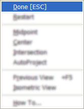
A dialog-based command can be concluded in four different ways described as follows:
Use the ESC key to cancel the active command. The result is that the active command is canceled and the Select Tool is activated. If an object is under construction, the construction is canceled and no objects result.
Select another command. The result is that the active command is canceled and the selected command is activated. If an object is under construction, the construction is canceled and no objects result.
The OK button is selected. The result is that the active command is canceled and the Select Tool is activated. Since the OK command was enabled, sufficient information must be present to create the object. The object is created.
The Cancel button is selected. The result is that the active command is canceled and the Select Tool is activated. If an object is under construction, the construction is canceled and no objects result.
Most objects created using a dialog-based command have the ability for their definition to be edited. Wherever possible, the same dialog is used for editing as for creation. This allows all aspects of the object's definition to be edited in accordance with changed design intent, or to recover from errors due to lost parents.
This command is enabled whenever all select actions are complete. In almost all cases, this means there is sufficient information to create the object. If one or more required select sets are empty, then the OK command is displayed but disabled. Also, in the case of an iterative or repeating (looping) command with Apply and Done pushbuttons, OK is never enabled at the same time as Done. In fact, the Done command button should switch to a Cancel command button when changes are pending.
The OK and Cancel pushbuttons are a pair. They should always both be available (enabled) at the same time.
When the OK command is selected, the object is created and the command window is closed. If there are pending changes, these changes are applied and then the command window is closed. Upon completion, the Select Tool is activated with the object just created as the only member of the select set. Where appropriate, the object should be in a modification state, which for most features means the dimension handles are displayed.
In the event that the object failed to construct, a relevant message is presented to the user and the command remains active.
Discards any pending changes and closes the window. Does not cancel or undo changes that have already been applied. When the user selects Cancel, the command is canceled and the Select Tool is activated. The select set is empty. For a large percentage of commands, Cancel is always enabled. However, in iterative and repeating commands, Cancel is available when the command is first invoked and then only when changes are pending after the first set of changes have been applied. When changes are not pending, the Cancel button changes to a Done command button.
Done is used to denote the user's successful completion of a command. It is used after one or more loops of applying changes in a command window. Done is not immediately available when a command is invoked -it takes the place of Cancel. It is only available after the first set of changes has been applied and there are no further changes pending.
Apply is used so that the user can preview changes while keeping the dialog readily available for further refinement or editing. Apply is only enabled when a change in the dialog is pending.
The Reset command is used to cancel pending changes without closing the window. The difference between this command button and Restore Defaults is that "Reset" should not result in the user's having any pending changes (the Apply button should be disabled and the controls should be returned to their last setting upon the last apply or command invocation. Restore defaults on the other hand will restore a command back to the base system settings, which may differ from the last applied state (resulting in the apply button to be enabled).
Within the Options Regions, gadgets should be laid out in option groups. Thought should be given as to what collection of controls address a common function from the user's viewpoint. In some cases, a group may contain only a single control. While these groups often take more space, they enhance the learnability of the product and provide topics that allow Documentation to discuss the nature of the command. The command designer is free to define whatever groups make sense. However, where possible the following terms should be used in group titles
|
Intent Size Direction |
Shape Position Extent |
The following button arrangements are typical for dialog boxes. Use these whenever possible. Of course there might be additional buttons required depending on the command window.
 Command dialog
 Tabbed options dialog prior to making any
changes (Apply disabled)
Tabbed options dialog prior to making any
changes (Apply disabled)
 Tabbed or iterative/repeating dialog with
changes pending
Tabbed or iterative/repeating dialog with
changes pending
 Iterative or repeating command dialog prior
to meeting selection/input requirements (OK and Apply disabled)
Iterative or repeating command dialog prior
to meeting selection/input requirements (OK and Apply disabled)
 Iterative or repeating command dialog after
the first set of changes have been applied and no changes are pending.
Iterative or repeating command dialog after
the first set of changes have been applied and no changes are pending.
In the above four cases, Reset is optional and would more likely be used in the case where iterative refinement is necessary to get the desired result. Reset would appear to the right of the Apply pushbutton.
 Tip dialog
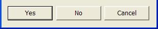
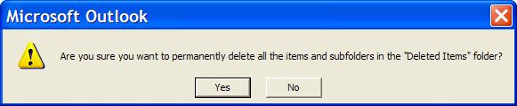
 Warning
dialogs should be more Yes/No in nature.
Warning
dialogs should be more Yes/No in nature.
Labels are always above a text control and justified with the left edge.
On data entry in a dialog, validation occurs on OK, Apply, or tab switch unless the data entered impacts the display of the dialog or the state of values in the dialog
Standard commands are commands that do not use a dialog. Many standard commands are single action such as Zoom All or Delete. Other commands such as Place Line are multi-action in that they automatically cycle to create multiple objects.
Some standard commands have a multi-step process that is not guided via a dialog. In these cases, the process is either self-evident or the user is guided via prompting in the message bar. However, such a command must allow direct modification for editing otherwise a dialog-based command must be used.
A standard command can be canceled in two different ways, described as follows:
Use the Esc key to cancel the active command. The result is that the active command is canceled and the Select Tool is activated. If an object is under construction, the construction is canceled and no objects result.
Select another command. The result is that the active command is canceled and the selected command is invoked. If an object is under construction, the construction is canceled and no objects result.
A looping (auto-cycling) command can be canceled in three different ways, described as follows:
Use the Esc key to cancel the active command. The result is that the active command is canceled and the Select Tool is activated. If an object is under construction, the construction is canceled and no objects result.
Select another command. The result is that the active command is canceled and the selected command is invoked. If an object is under construction, the construction is canceled and no objects result.
If the command automatically cycles without a dialog, then the user can cancel the command via the first entry in the context menu.
The system shall support at least one level of command stacking (or more if development desires). Basically, there are two types of command, those that support a stack and those that are stacked. By default, all object creation commands support stacking, but only a limited number of commands can be stacked. By default, the following types of commands can be stacked:
Viewing commands
Work Feature commands
The question arises how a stacked command is canceled, thus returning the user to the base command. Single action commands such, as Zoom All, auto-cancel so there is no issue. Commands such as Rotate View do not auto-cancel. As described in section 3.1, the user can use the ESC or Context Menu to cancel such commands.
A key difference between Viewing and Work Feature commands is that Work Feature commands create objects. When a Work Feature command is invoked during another object creation command, the object under creation consumes the resulting work objects. When this is not the case, global Work Features are created as stand-alone objects.
From a user's viewpoint, there should be no difference between the two forms of the Work Feature commands.
There are many commands that make use of a dialog that are not used to create or edit an object. Typically, these commands employ modal dialogs. Some examples might include Mass Properties, Interference Analysis, Equation Editor, and Named Views. When a dialog is required, commands of this type should be designed to look like standard Microsoft Office style dialogs.
It is not always clear whether a command should be of the Standard or Dialog form. Some commands can go either way. The key is to maximize the discoverability and retainability of command options and workflow. Following are some guidelines that may assist in the choice.
Dialog Commands
Have command options that can not be intuitively presented to the user by graphical manipulation.
The mainline workflow is easier to understand if lesser-used options are hidden.
Generally, includes all feature-creation commands.
Standard Commands
Have three or fewer steps.
Have three or fewer command options.
The command options can be intuitively presented to the user through graphical manipulation.
Generally, include all sketching commands.
Command Looping (Iterative and Repeating)
Users will want to use this function sequentially, repeatedly, more than 60% of the time.
The function may require the user to make several refinements to get the desired result (dialogs that usually have an Apply pushbutton).
Looping can be done through a dialog or without a dialog (e.g., Line). This type of dialog will frequently have an Apply pushbutton and may have a Reset pushbutton.
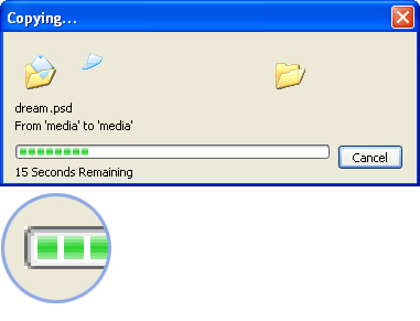 It is
extremely important to communicate progress to the user when an operation will
require a noticeable amount of time. As
a rule of thumb, a progress indicator should be used when an operation's
elapsed time exceeds three seconds. The
exact nature of the progress indicator may change depending on the
operation. Two standard mechanisms that
may be employed are the use of the hourglass cursor or a progress bar in the third
section of the status bar.
It is
extremely important to communicate progress to the user when an operation will
require a noticeable amount of time. As
a rule of thumb, a progress indicator should be used when an operation's
elapsed time exceeds three seconds. The
exact nature of the progress indicator may change depending on the
operation. Two standard mechanisms that
may be employed are the use of the hourglass cursor or a progress bar in the third
section of the status bar.
Progress Indicator
The progress indicator is composed of the progress track and the progress indicator. The progress track is the outline of the progress indicator. The progress indicator is the green square that fills the progress track.
All commands should display helpful textual information throughout the workflow. These messages are displayed in two areas in the Autodesk Inventor application: 1) in the second command bar container at the top of the application, and 2) in the status area (command bar container) at the bottom left of the application window.
The Messaging textfield contains a maximum of 65 characters with the default Windows font. When creating strings that must be localized into German and Spanish, we should try to stay ~30 characters and not to exceed 45 characters.
Autodesk,
Autodesk Inventor, and 3D Studio MAX are registered trademarks, and 3ds max is
a trademark of Autodesk, Inc., in the
|
